Failure of my “brilliant idea”
I had a brilliant idea. It was clever, innovative, and had everything needed to be successful. It even had working examples in several larger companies. This is the story of my failed “brilliant idea.”
COMPANY
"SkoolBag" is a communication platform connecting schools and parents.
PRODUCT
Mobile app for parents to receive content from schools
DESIGN TASK
Reduce the number of tickets related to login issues
ROLE
Lead Product Designer / Product Owner
PLATFORM
Mobile application
KEY RESULTS
- Eliminated login issues for 500,000 users
- Unexpected technical and usability issues
“SkoolBag” (now “Audiri”) is a communication platform, where the two main products are:
- School admin console (content creation web app)
- Parent app (content interaction mobile app)
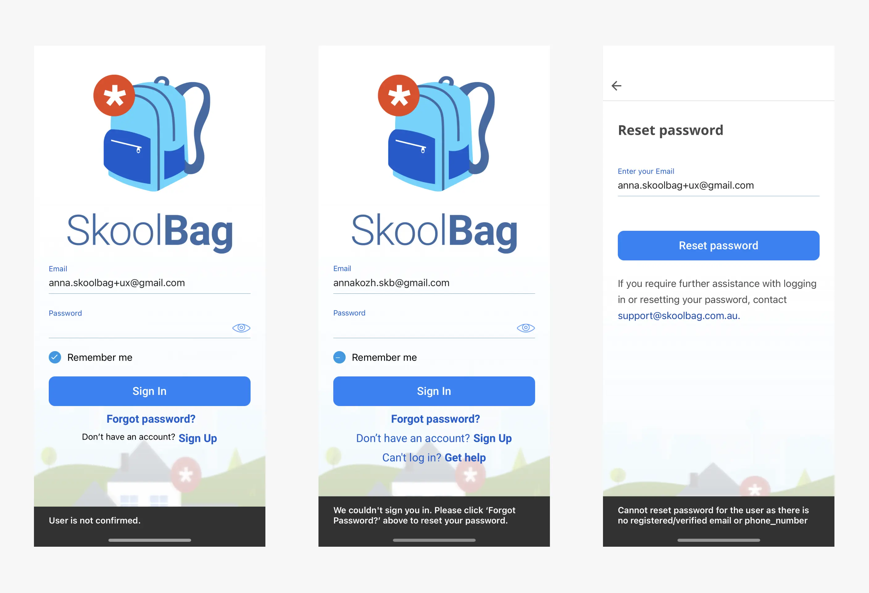
In 2021, during my time with SkoolBag, parents were required to sign up for a mobile app to receive school news updates. Registration flow was pretty standard.

Log in issues
Even though the registration was straightforward, we frequently received tickets related to parents being unable to log into the app.

After conducting research, we identified two problems with our implementation:
- UNCONFIRMED USERS: existing users, whose accounts were unconfirmed. Mostly because they either didn't receive or didn't act on the confirmation email.
- PASSWORD_RESET USERS: users who reset their passwords, but haven't set a new one yet.

There were certainly many technical solutions to these issues, but due to time constraints, the goals were:
- Ensure parents can log in by any means
- Make minimum changes to the technology
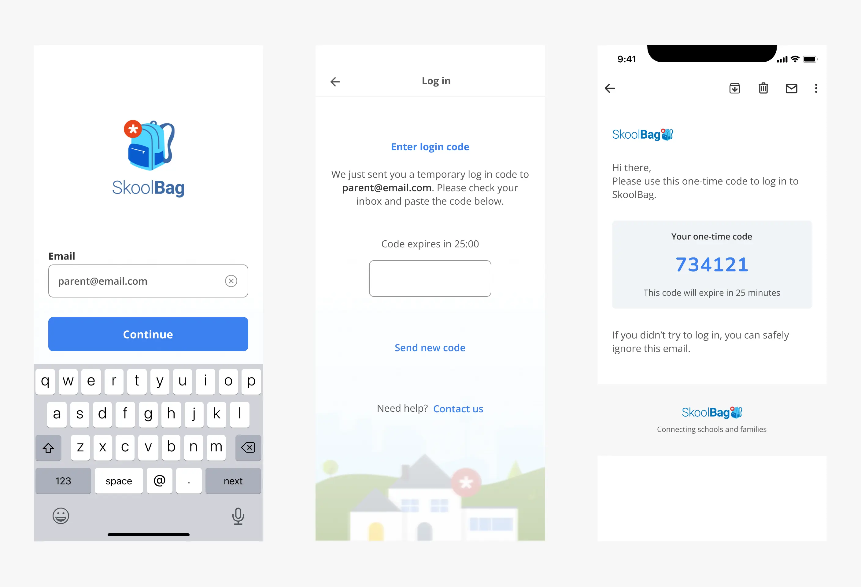
OTP to the rescue
One-Time Passwords (OTP) were getting more common and provided an effective log in method. SkoolBag users stayed logged in as long as they could, so remembering yet another password was a challenge.

Implementing OTPs offered several advantages:
- OTP replaced the outdated and clunky confirmation flow
- It served as an alternative way to log in, for both UNCONFIRMED and PASSWORD_RESET users
- It decreased the need for password resets
- During the signup, it kept users within the app, which decreased the number of UNCONFIRMED users
OTP was a big hit, to this day parents use it more than passwords.
Brilliant idea
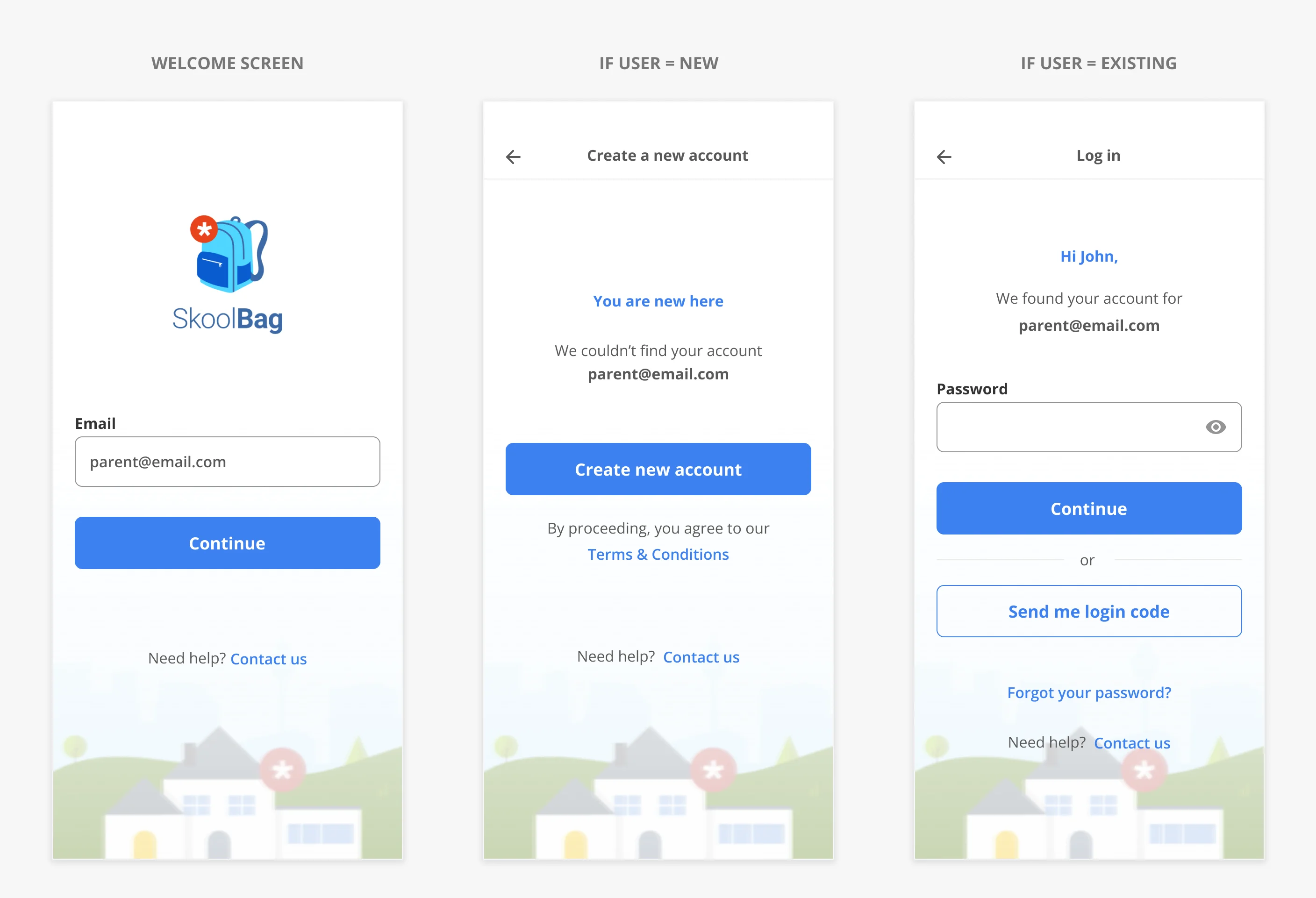
Even though the initial problem was solved, I decided to combine signup and login in one flow. I got inspired by several apps, where the user simply entered their email, and the system automatically redirected them to the appropriate flow: Login or Signup.

In theory, it was supposed to work great for all the use cases and it seemed to make login and signup extra simple.

Confused users
After a while, we started receiving feedback from parents saying:
This is what happened:
- The solution broke users’ mental model: most users are used to seeing either Login or Signup options on the web.
- The reset password was only visible after the user got on the login flow.
- In the current implementation, It had significant engineering challenges: latency, and security impact.
Lessons learned
Even “brilliant ideas” need to be tested. Even widely used patterns should undergo testing with your users. Aim for simplicity with established mental models.
