Creating multi-brand white label design system
Developers hate guessing design. Trying to work with an outdated, inconsistent design file can literally make them pull their hair out. This is the chaos I walked into. This is the story of how I transformed it into a multi-library, white-label design system.
COMPANY
"Simpology" is an Australian fintech company that develops white-label products for the lending industry.
DESIGN TASK
Transform the design mess into a structured, easy-to-maintain system.
ROLE
Lead Product Designer
PLATFORM
Web application
KEY RESULTS
- The new design file structure is easier to navigate and maintain
- Design deliverables are more consistent and clear
- Feature turnaround sped up significantly
- Branding a product file is now a 2-second task
"Simpology" is an end-to-end home loan application platform. The company offers multiple products, which lenders can customize to seamlessly integrate with their existing ecosystem.
Welcome to our mess
When I joined the company, there was a significant disconnect between design and development. A consultant created Figma files and handed them over to the team in a very waterfall manner.
Throughout the iterations, design has evolved, component libraries were adopted, and customer brandings were created - but the design files stayed the same.
I inherited a dozen Figma files, each with its own local library of colors and fonts. Every task became unnecessarily time-consuming, whether it was branding a file for a customer or detailing the interaction flow for the team.
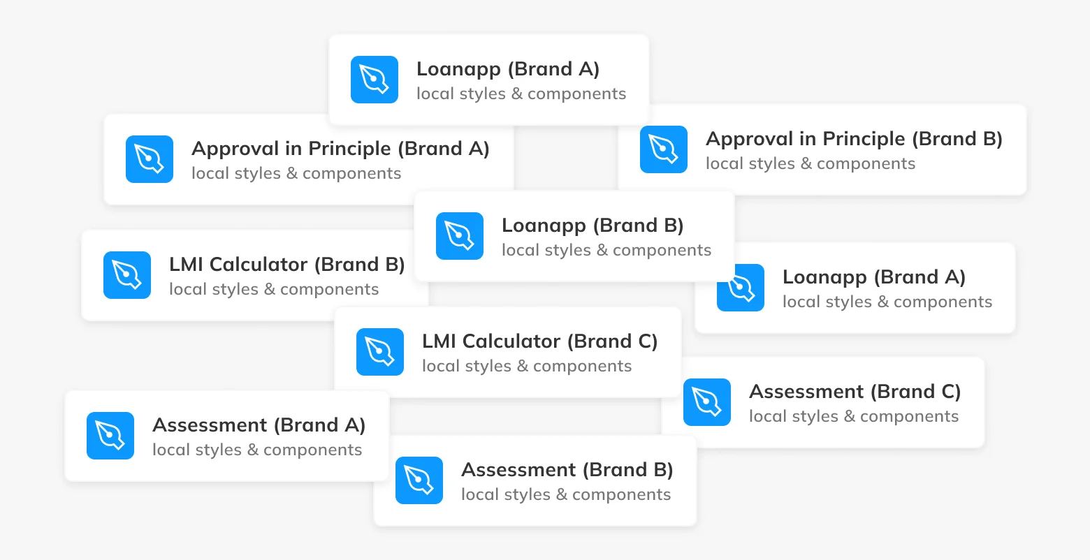
Phase 1 - Get on the same page
In Simpology, like any fast-growing company, design debt wasn't a high priority. To get us on the same page, design had to catch up with implementation and iterate from there.
I partnered up with front-end developers to clean up all the style primitives that were used to create branding. These primitives were then added to Figma to match the implementation.
For each brand, I created a library file, consisting of 81 color styles matching the naming devs used. All the brands shared a design system with the UI components.
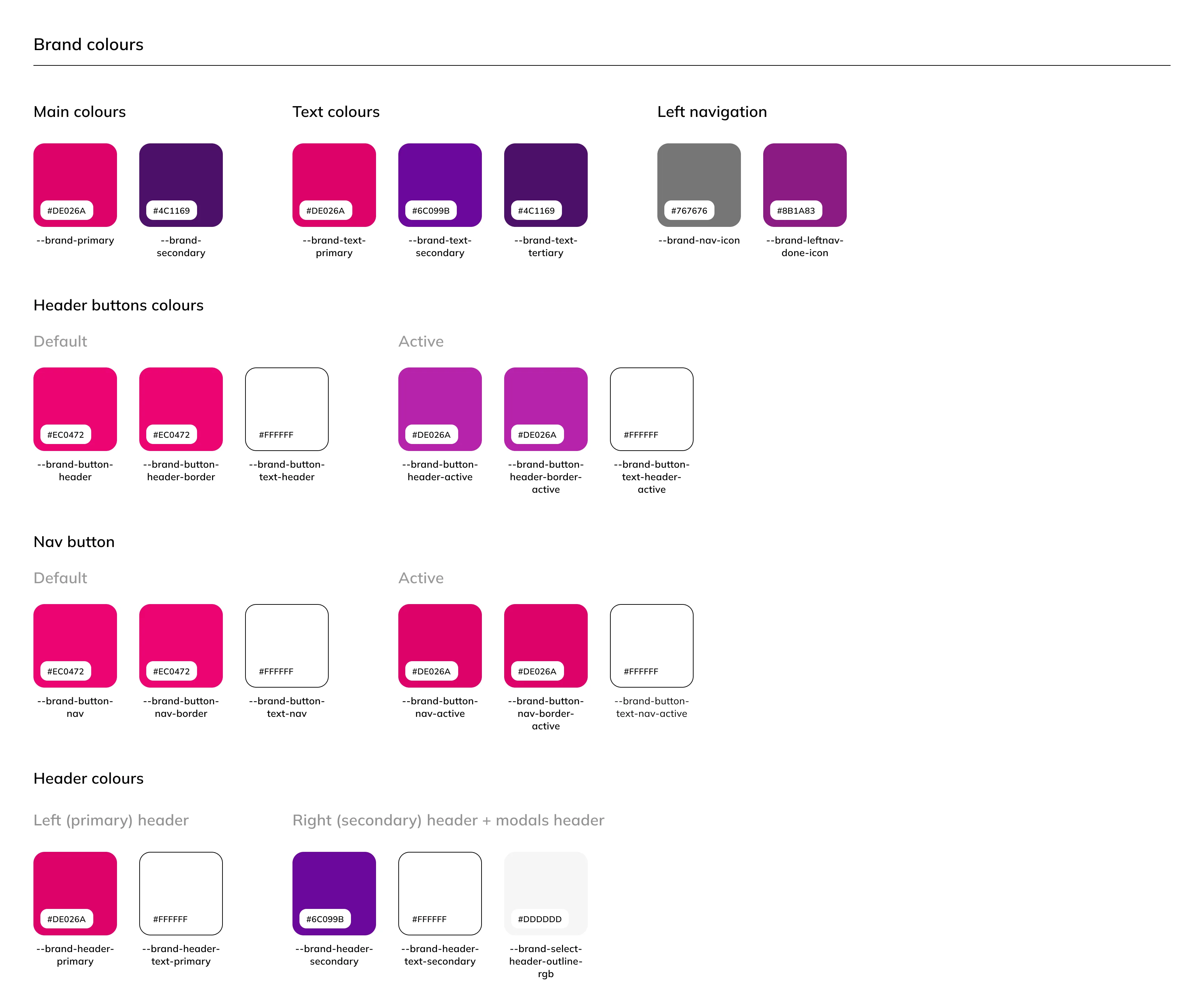
In addition, I recreated all wireframes to match the current implementation.
It’s an improvement
The team now had design files that reflected the current state of implementation. All new features were now designed using existing components and matching libraries. A shared naming convention eliminated a lot of confusion with the design deliverables, which improved front-end task completion speed by 32%.
That worked pretty well, but had a few flaws:
- Swapping libraries only worked on finished wireframes. Any change would revert a component to its original library.
- Maintaining the libraries was a part-time job. When a style was added or changed, I needed to update them all.
Phase 2 - Era of variables
During Figma Config 2023 a life-changing feature “Variables” was announced.
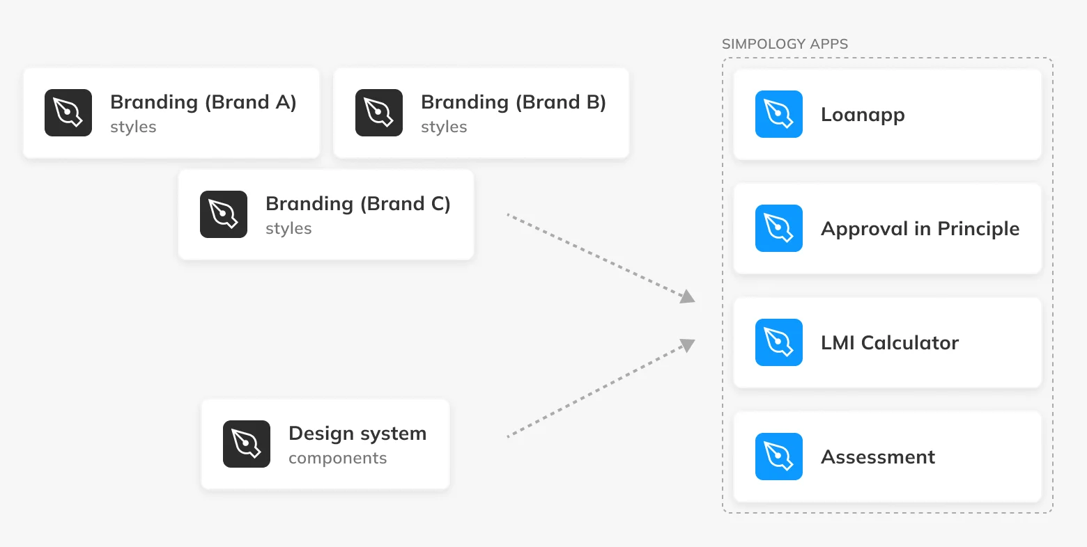
Now, I was able to combine all customers' styles and logos into one file “Branding” using variables.
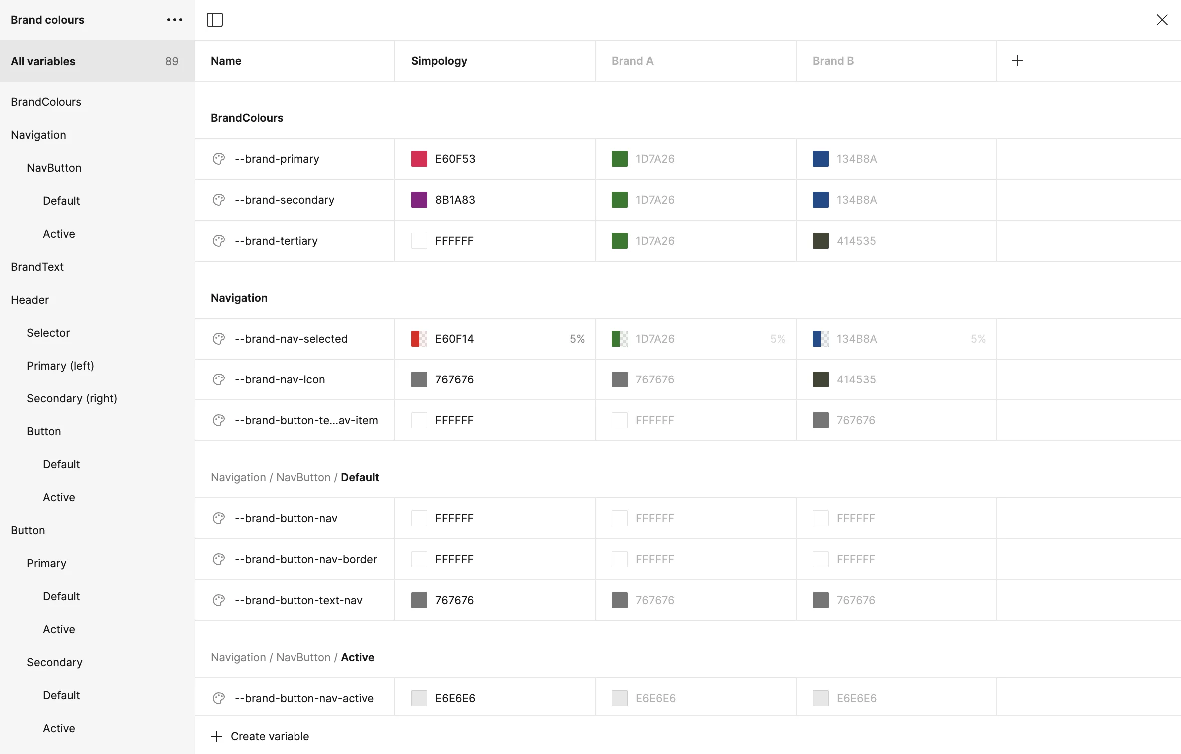
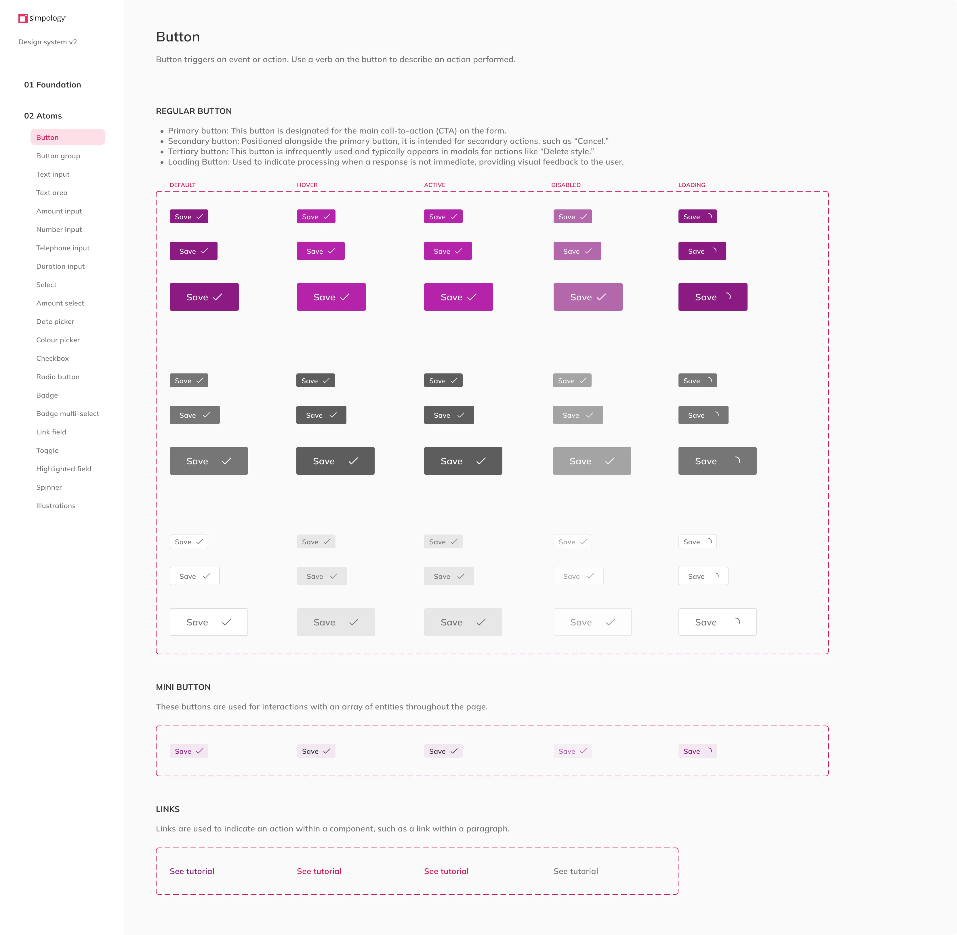
I also rebuilt the design system using component variants and properties.
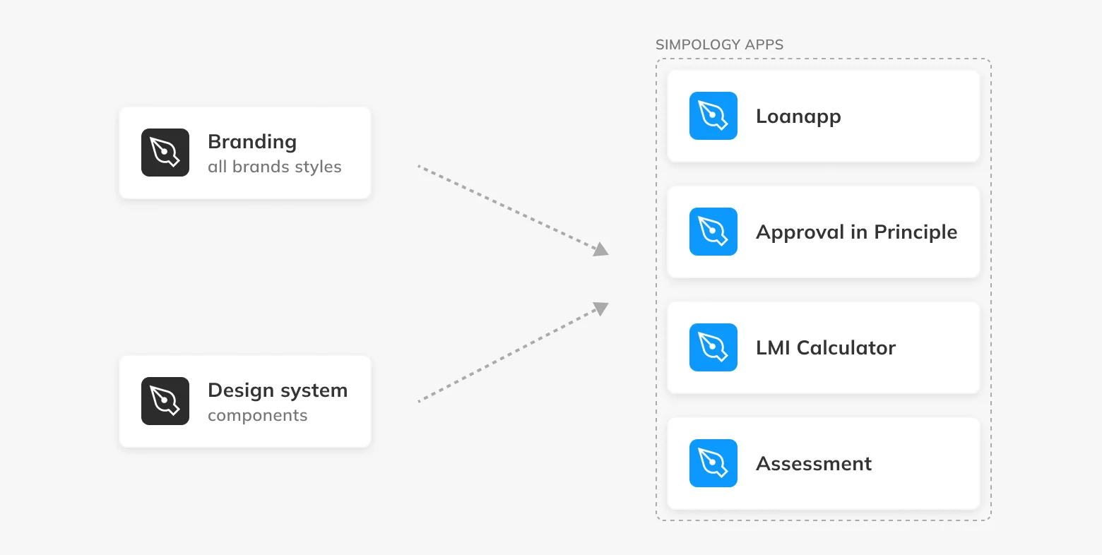
Both libraries contributed to the ecosystem of Simpology products:
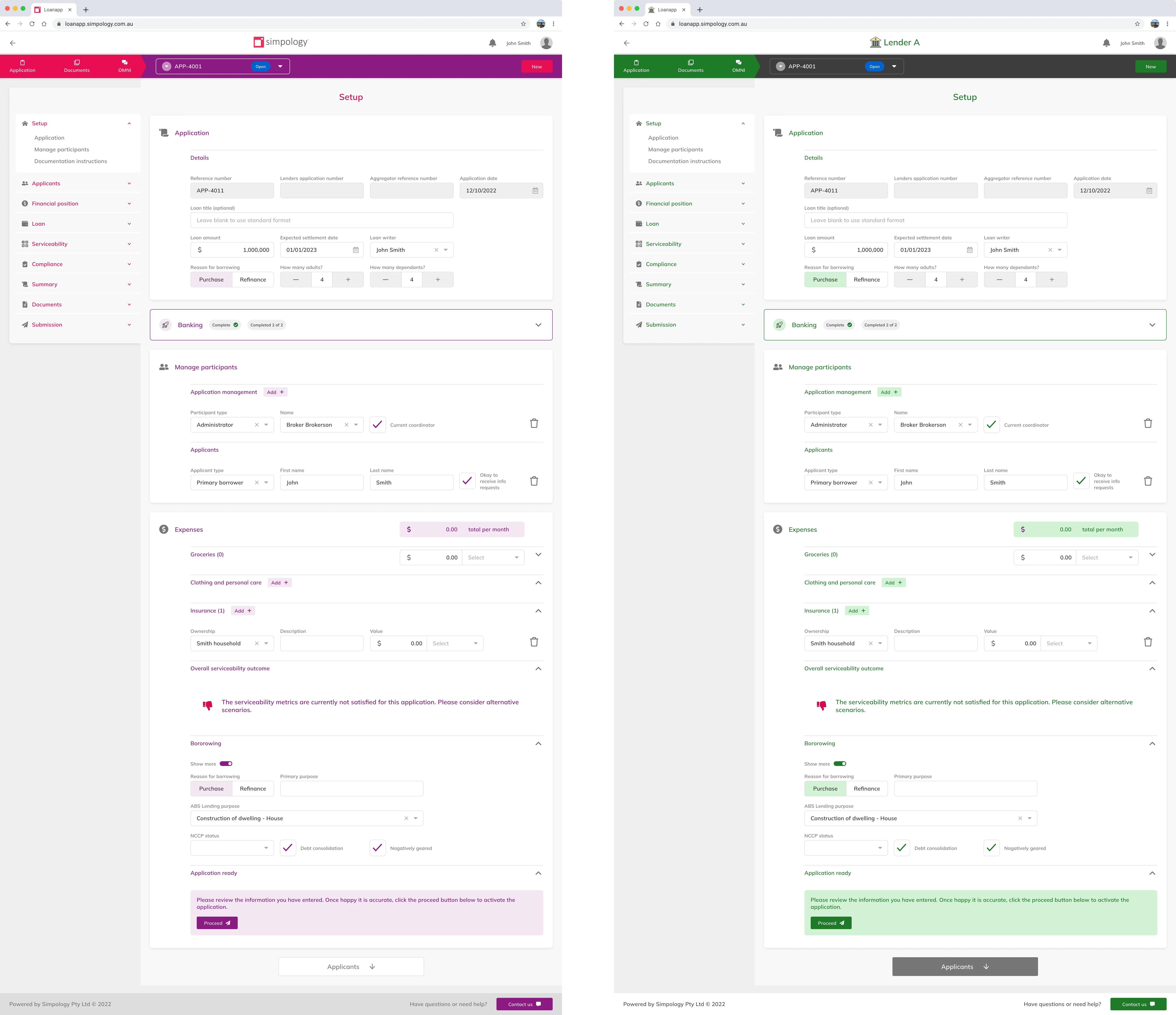
This worked much better
- Rebranding Loanapp now takes only 5 seconds
- Working on the branded file no longer disrupts the styles
- Maintaining the color schemes is very easy now - they are all in one table.
The future is bright!
Currently, we have a good system of libraries that meets the company's needs. However, as Simpology grows, we need new improvements:
- I'm working with developers to add spacing and typography to the design system.
- Implementing design tokens to improve design consistency.
- Establishing new processes and practices, such as RACI, as the design team expands.
