How I convinced my manager
"Don’t change the original design," my Product Lead told me on my second day at Simpology. He had designed the whole solution two years before I joined, and the team had already implemented 20% of the design. This is a story about how I changed the original design.
COMPANY
“Simpology” is an Australian fintech company dedicated to improving the mortgage application process.
PRODUCT
“Loanapp” is a loan origination platform for brokers.
DESIGN TASK
Enable customers to brand the platform as their own.
ROLE
Lead Product Designer
PLATFORM
Web application
KEY RESULT
Reduced the amount of time needed to create branding to just 1 minute.
Loanapp is a web platform for Australian lenders to create and evaluate home loan applications. It lets customers customize everything, from form fields to colors. These colors are stored in a JSON metadata file with 81 variables. Previously, customers did not have an easy way to brand the platform themselves.
The goal of this project was to create a tool that makes it easy for customers to create their own branded color schemes for the app.
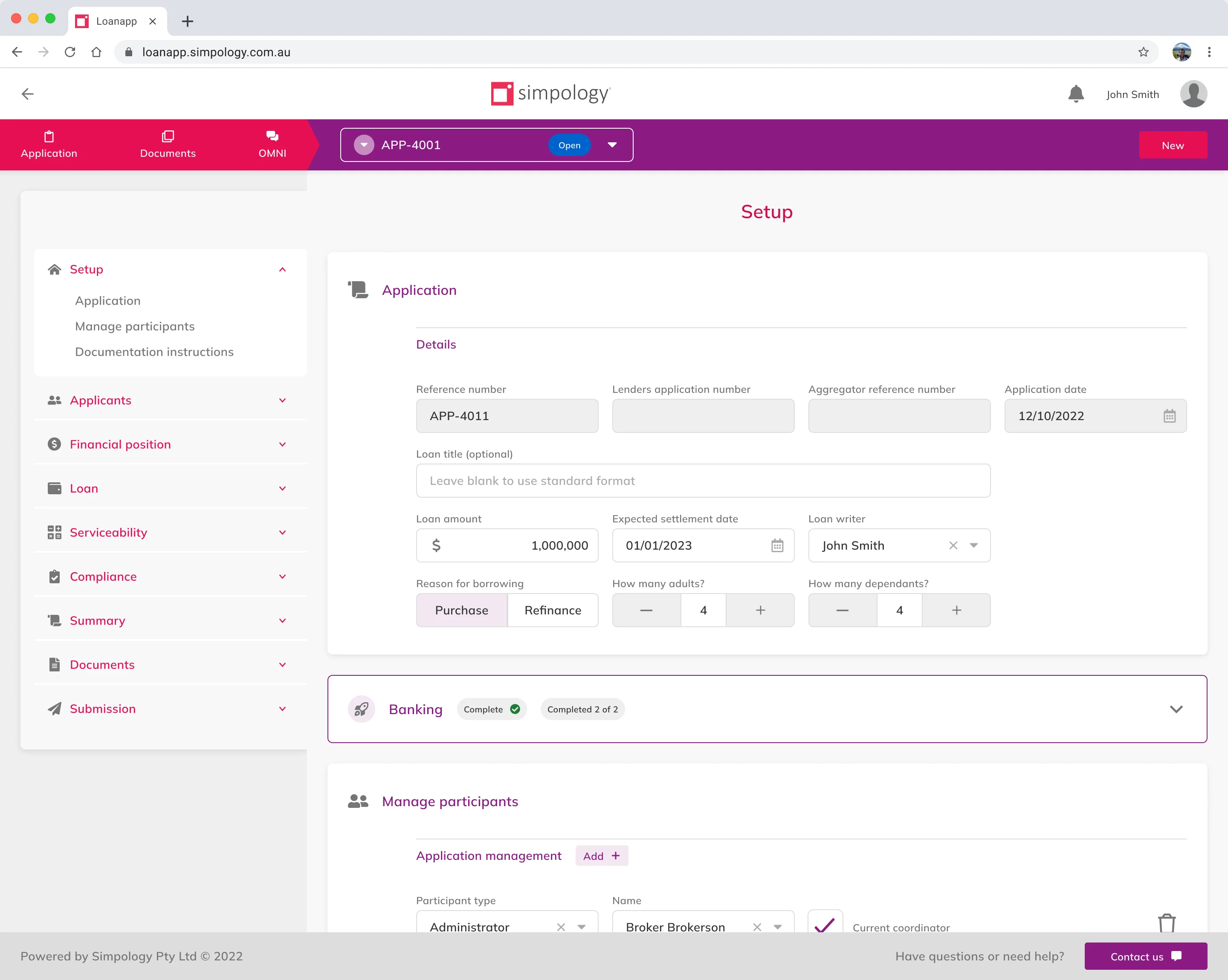
"But we already have a design!"
The design for the branding tool already existed. It had been created three years earlier, before any development work or research findings. Still, my Product Lead was convinced that it was the best solution. After reviewing the design, I identified discrepancies with the current color implementation and found usability problems.
While I'm good at finding simple, practical solutions, I struggled to effectively communicate with this manager, who was reluctant to change the design.
6 months earlier
Six months before this work was prioritized, I had created an interim branding solution for customers in Figma. That was an editable library of 81 styles, along with a tutorial, so that customers could easily modify the styles and create their own color scheme.
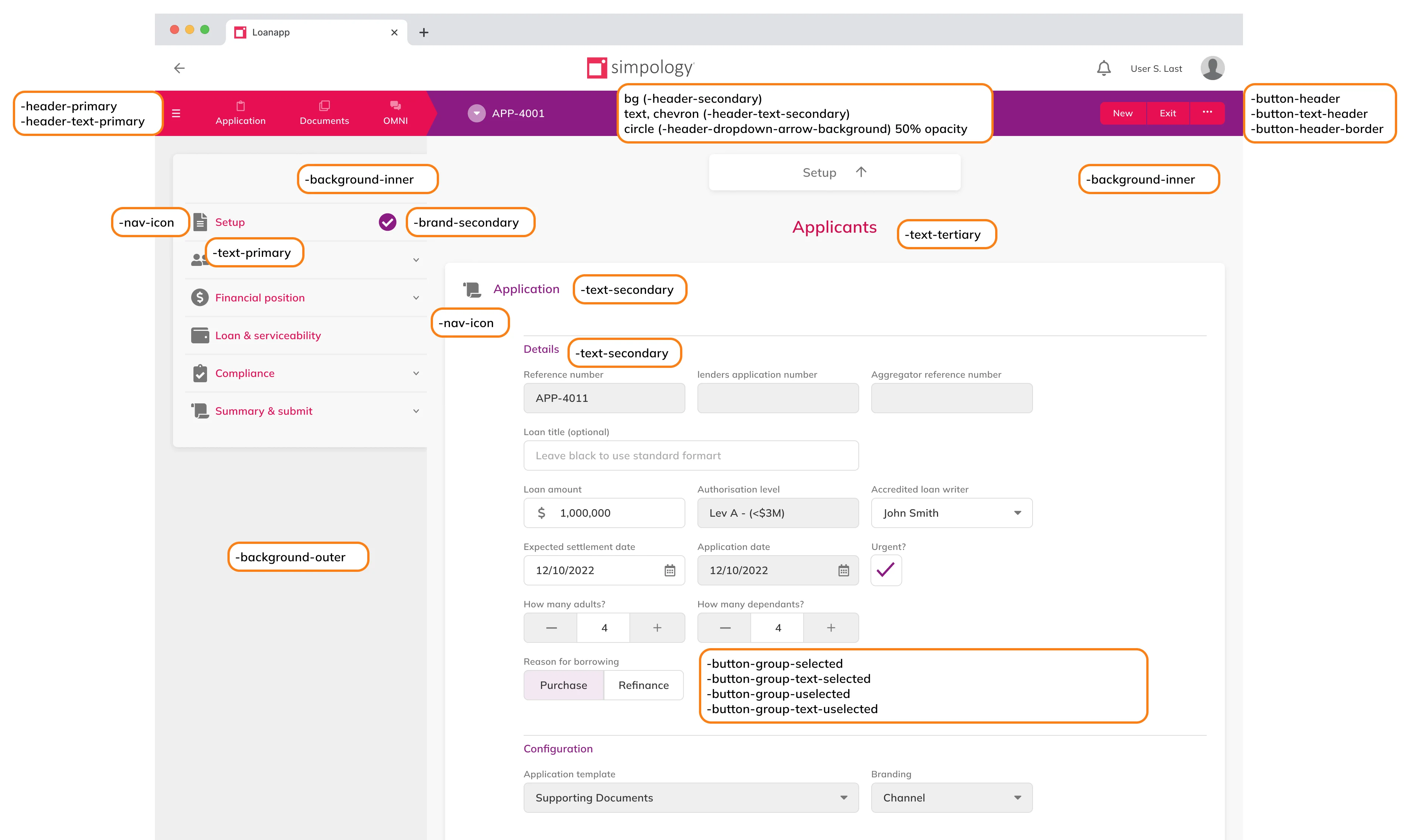
Although customers loved the tool, some of them lacked the skills or capacity to change the styling themselves, so they asked me to do it for them. I created around a dozen style guides for different lenders in Australia.
After a while, I realized that I only needed three colors from the brand to create the entire set.
Fast-forward to the present day
I incorporated these findings into design where users were asked to provide three brand colors, along with corresponding text colors.
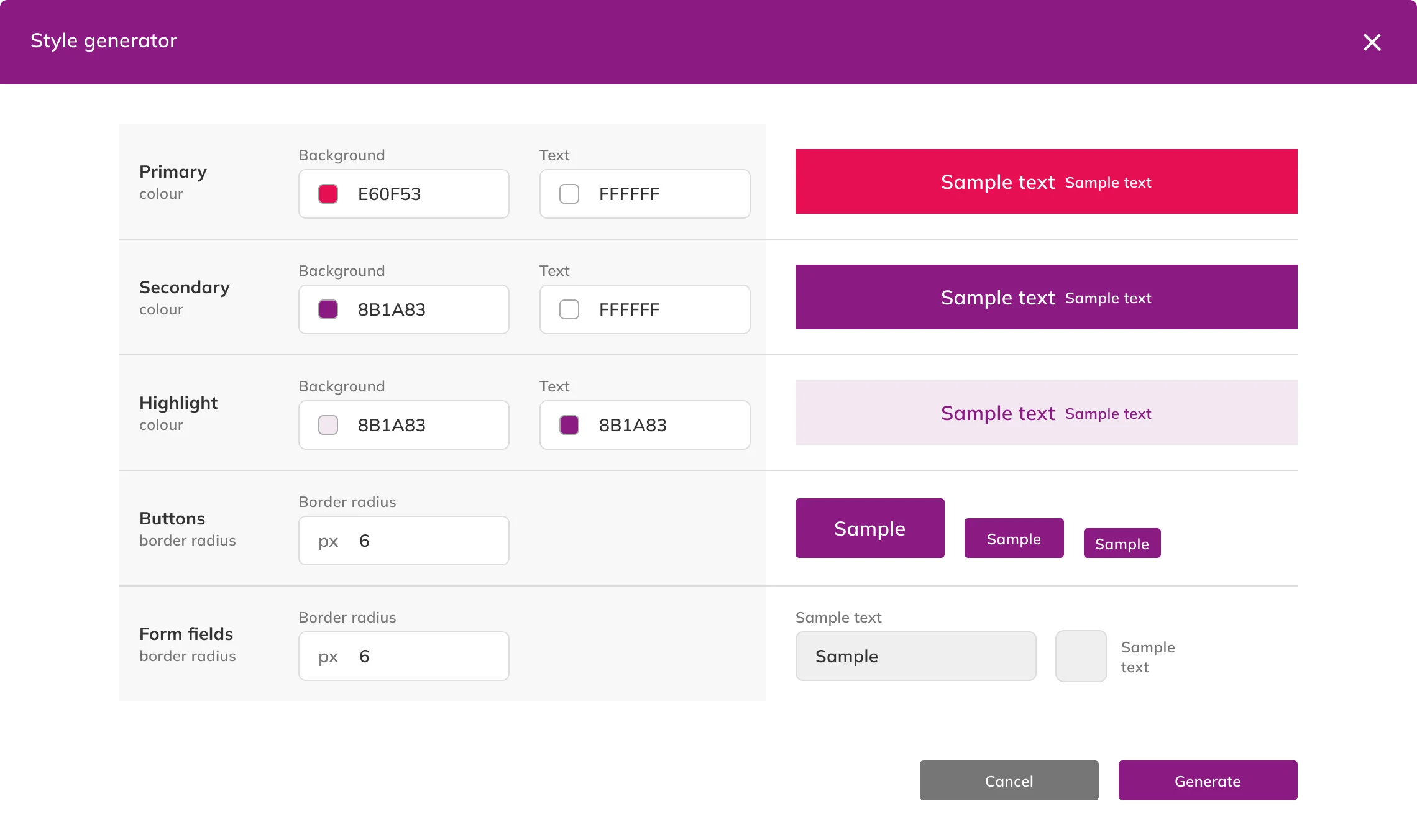
The six colors were used to generate all 81 colors required for the color scheme, based on the mapping I created. For example:
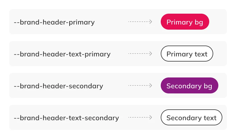
This design provided users with a solid starting point, which would help them create the whole style guide, with maybe just a few small tweaks.
I also added a JSON editor to allow the CX team to upload the colors that were imported from Figma, which some customers still preferred to use.
"Anna, don’t change design!"
I presented the design to the Product Lead, but he quickly dismissed it. I felt frustrated, I found myself stuck with a design that was hard to defend to actual developers. As a result, self-doubt began creeping in.
Let's get strategic
Believing I was capable of changing his mind, I decided to approach the problem strategically:
- Understand why he was so reluctant to change the design
- Gather data
- People don’t like change, so don’t change everything at once
- Be clear and concise
From what I gathered, he was stretched thin, with his day packed full of meetings. As a result, revisiting the original design was not a priority for him.
I tested my prototype with the CX team and collected their supportive feedback on my ideas.
I chose to reintroduce elements of the original design so it didn’t feel like a complete overhaul. This way, I was enhancing the user experience rather than making drastic changes.
I presented my idea by highlighting "what I have added", instead of focusing on "what is wrong with the current design".
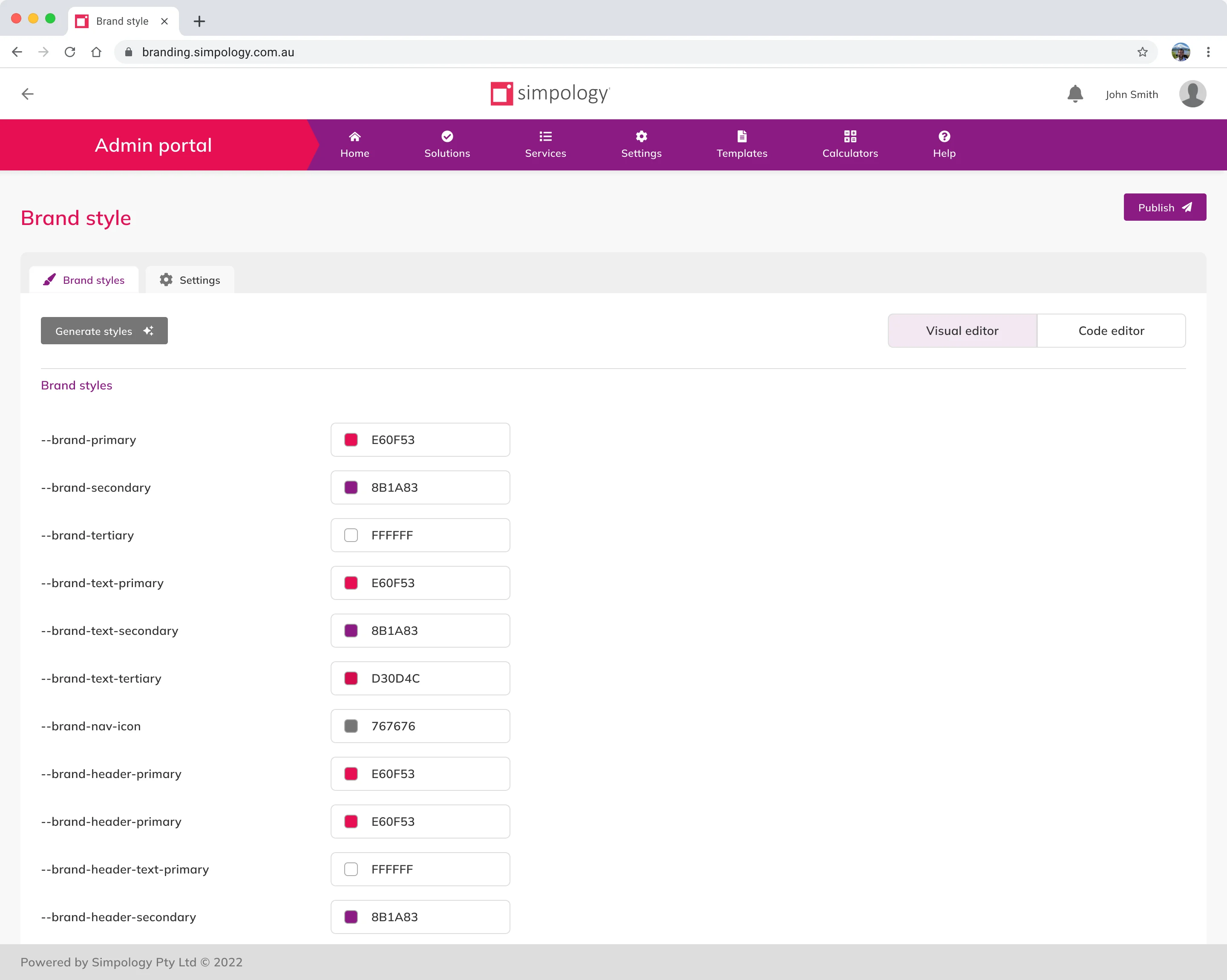
"It's great!"
The branding tool was implemented, and this is some of the feedback I received from the CX team and leadership:
What would I do differently?
- Implementing a WYSIWYG tool would have been a significant improvement, but it would have required more time and resources, which the company didn't have at the time.
- Instead of using a modal, which causes usability issues, I would explore alternative solutions.
- Additionally, I would prioritize testing with users.
