Two-sided marketplace
At SkoolBag, we explored launching a two-sided marketplace: a place where parents could discover and book kids’ activities, and providers could list and manage their offerings. We called it KidScene.
COMPANY
SkoolBag (parent-school communication products)
ROLE
Lead UX/UI Designer, Product Owner
DURATION
30 weeks
TEAM
2 FE, 1 BE, QA, PM, UX
PROBLEM
In Australia, there was no central place for parents to find and book kids’ activities, or for providers to list and manage them.
OPPORTUNITY
Use SkoolBag’s trusted school-based communication platform (1M+ parents) to pilot a discovery and booking marketplace.
IMPACT
- Validated demand from parents for a centralised booking platform
- Collected buy-in from all interviewed providers
- Validated reuse of existing console and login flow
- Upskilled the team in responsive, accessible front-end
My role & influence
- Owned the product and UX design end-to-end
- Led discovery through user interviews and competitive analysis
- Defined scope, wrote user stories and UX specs
- Designed all core flows: search, filtering, booking and messaging
- Created high-fidelity, responsive UI across mobile and desktop
- Built the brand identity and style guide
SkoolBag new initiative
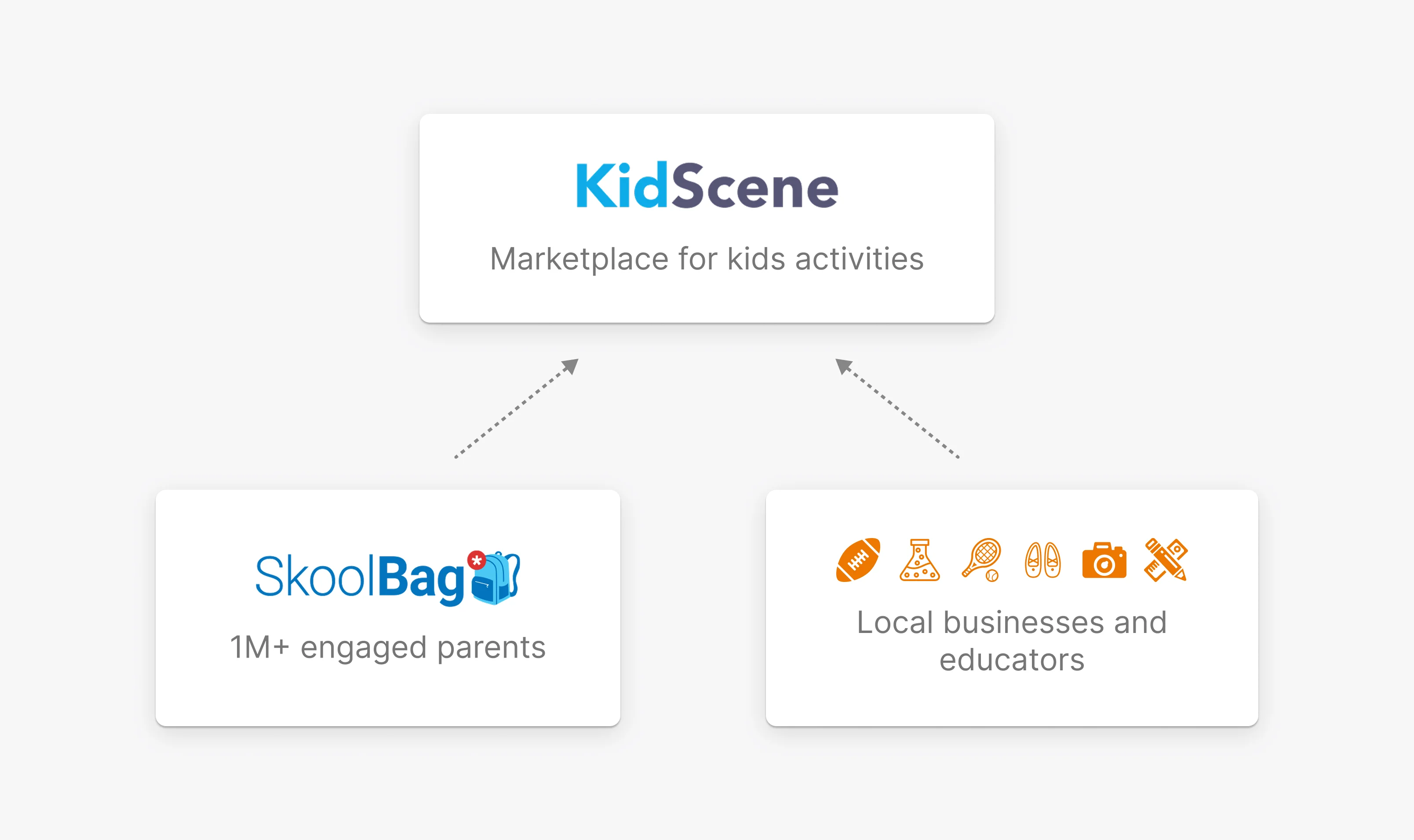
KidScene is a two-sided platform connecting parents with kids' activity providers. SkoolBag's strategy was to expand beyond school communications and create a new revenue stream in the kids’ activity space.
The opportunity
- 1M+ parent emails already in the ecosystem
- Recently built admin console ready to repurpose for providers
- Almost no direct competition in the Australian market
- Strong brand trust with schools and parents
Research
I led all early discovery, including user interviews and competitive analysis, to understand pain points, uncover unmet needs and validate the opportunity.
User interviews
Parents
Key insights
- Booking is often manual (emails, PDFs)
- Forms are repetitive (medical, liability, direct debit)
- Discovery is scattered
- Value low-commitment, casual activities with minimal paperwork
- Didn’t trust reviews, relied on personal networks
Providers
Key insights
- Managed bookings across tools (Zoho, spreadsheets, emails)
- Communication was fragmented and hard to scale
- Wanted to show up better in listings via photos, videos, and response rates
- Wanted reusable templates, locations, and bulk editing
- CRM integration is missing
Australian kids activity market
- No central hub: most bookings happened offline or through outdated, custom systems.
- The only competitor had low adoption and didn't scale well.
- No reusable setup: providers had to recreate forms, schedules and pricing each time.
- Unique Australian parent mindset: activities are planned around Terms, Holidays, and one-off Events
Problem statement
In Australia, there was no central place for parents to find and book kids’ activities, or for providers to list and manage them.
Parent, Provider & Business needs
Parent needs
- One trusted place for vetted local activity discovery
- Effortless filter through options
- Easy and efficient booking flow
- Confidence in safety and quality
Provider needs
- Simple way to list and manage offerings
- Scheduling that matches how they operate
- Reusable templates to save time
- Direct access to local parents
Business needs
- Validate market potential
- Leverage existing parent base
- Reuse existing infrastructure
- Explore low-cost B2B2C monetisation
bookmarkHow might we validate both sides of the marketplace with a lean MVP?
Success metrics
- 70% of active providers published a listing
- 50% of parents who viewed a listing started a booking
- 30 real bookings completed during the pilot
- 1+ monetisation path validated through provider feedback or behaviour
Scoping for validation
The approach was to build the smallest possible version that let us test supply, demand and usability without creating new systems or introducing unnecessary risk.
Key tradeoffs
| Tradeoff | Rationale | What it enabled |
|---|---|---|
| Reused existing admin console for providers | Saved months of dev work | Allowed us to focus design effort on the parent experience |
| Designed for accessible mobile-first | Expected a significant mobile traffic | Easier to expand simple layouts into flexible desktop |
| Limit features to core value | Not essential to test real user behaviour | Allowed us to move faster, reduce complexity and validate the end-to-end value loop |
bookmarkBuild to fail fast. #LeanStartup.
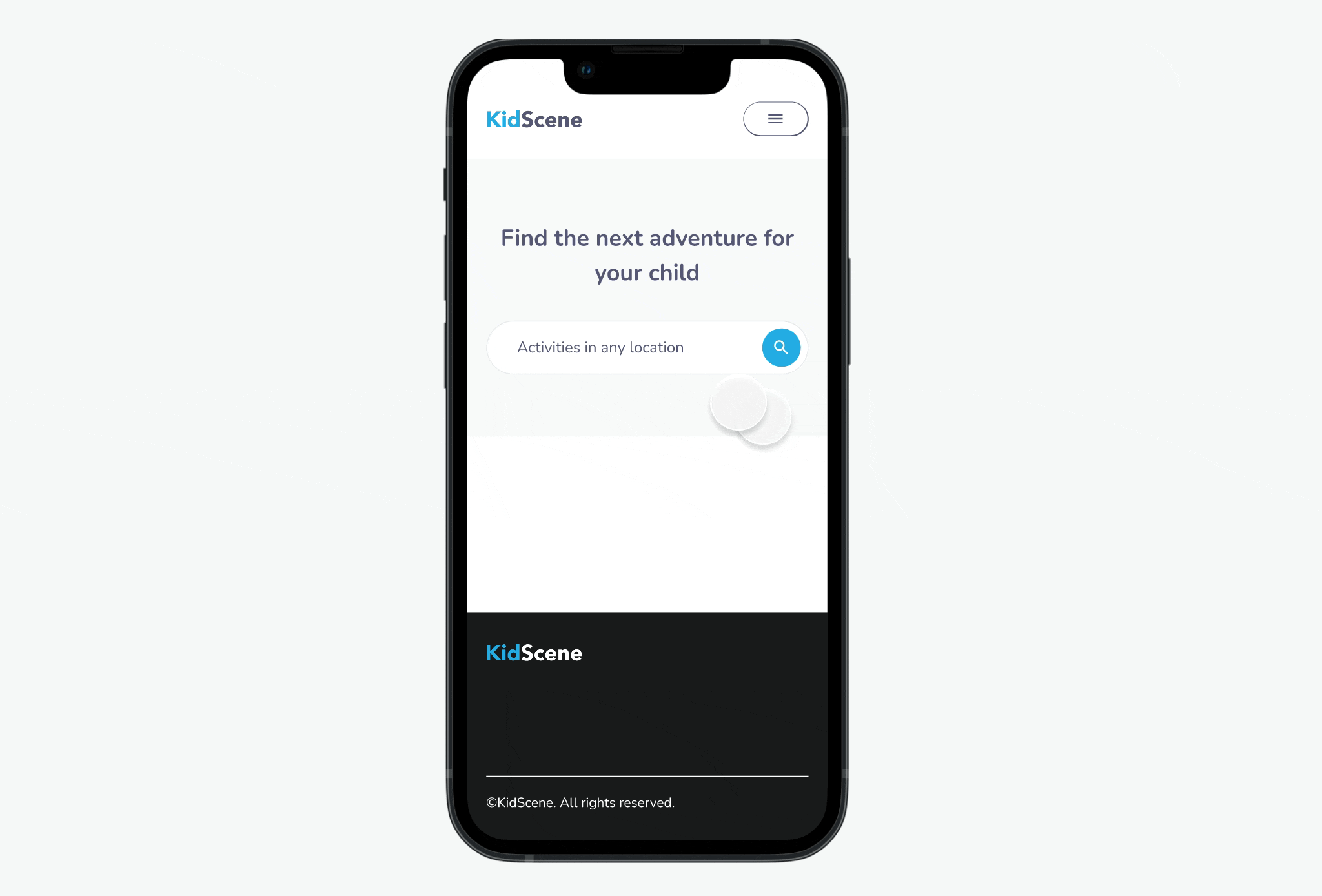
Two-sided market
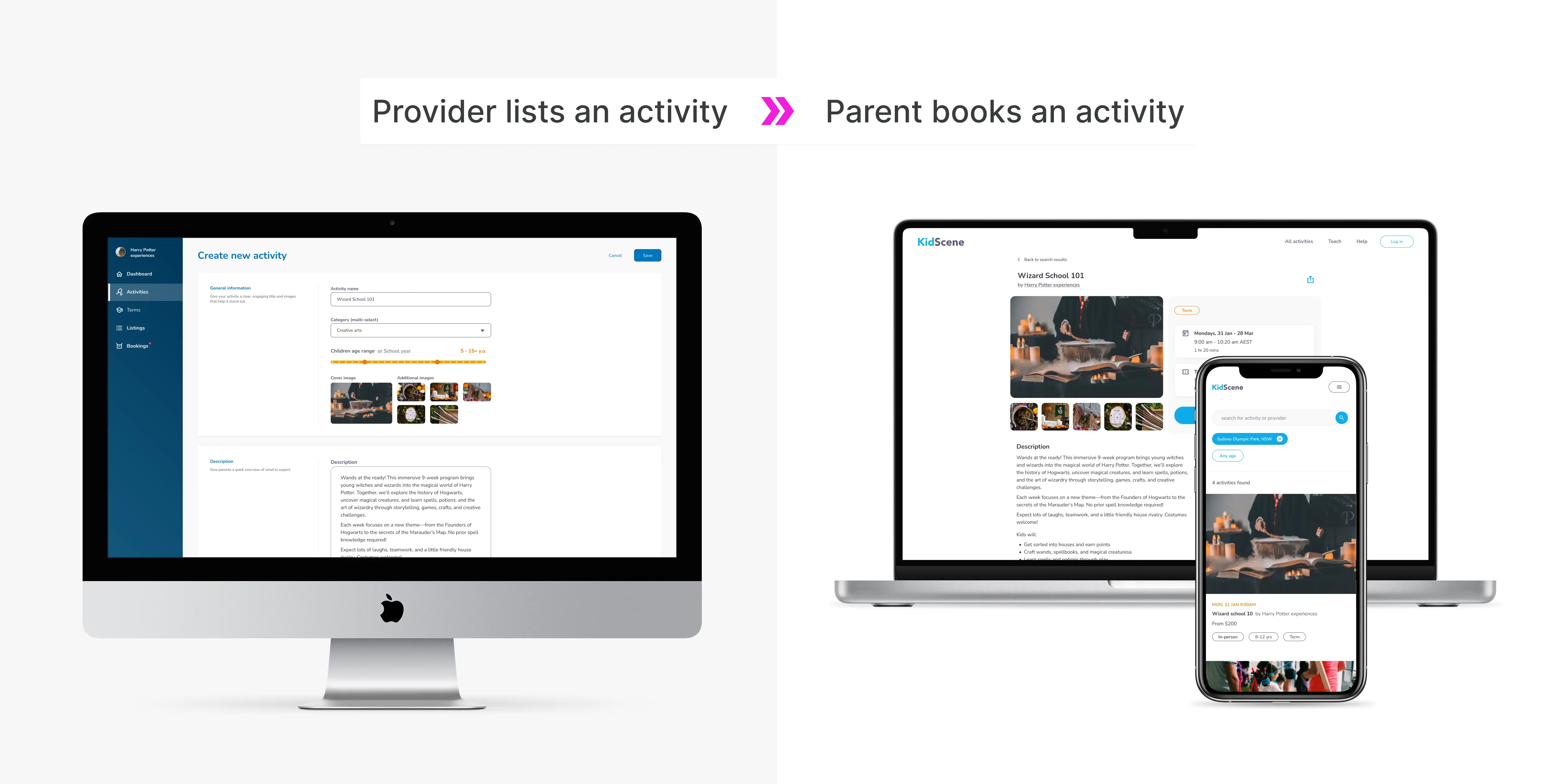
Most effort went into responsive parent UX, the riskiest and most user-facing part. I mapped the full journey for future scale but handed off only the first iteration. The provider side reused the existing SkoolBag admin console, adjusted for activity listing setup.
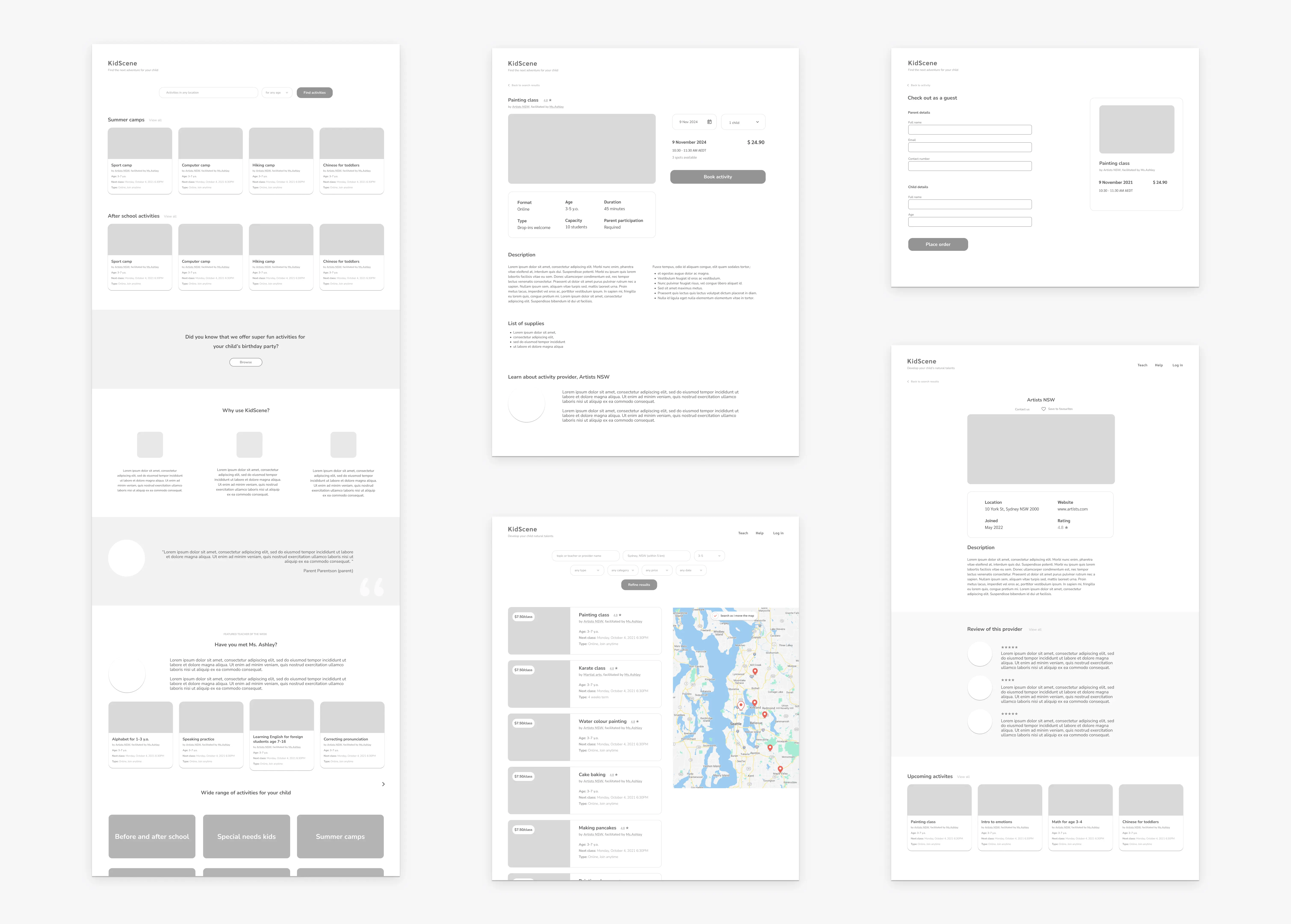
Lo-Fi for alignment
I created low-fidelity wireframes to map the full parent flow and align on scope early. I used them in stakeholder reviews to confirm the overall direction, validate filtering and booking logic and reduce risk before committing to UI.
Key design decisions
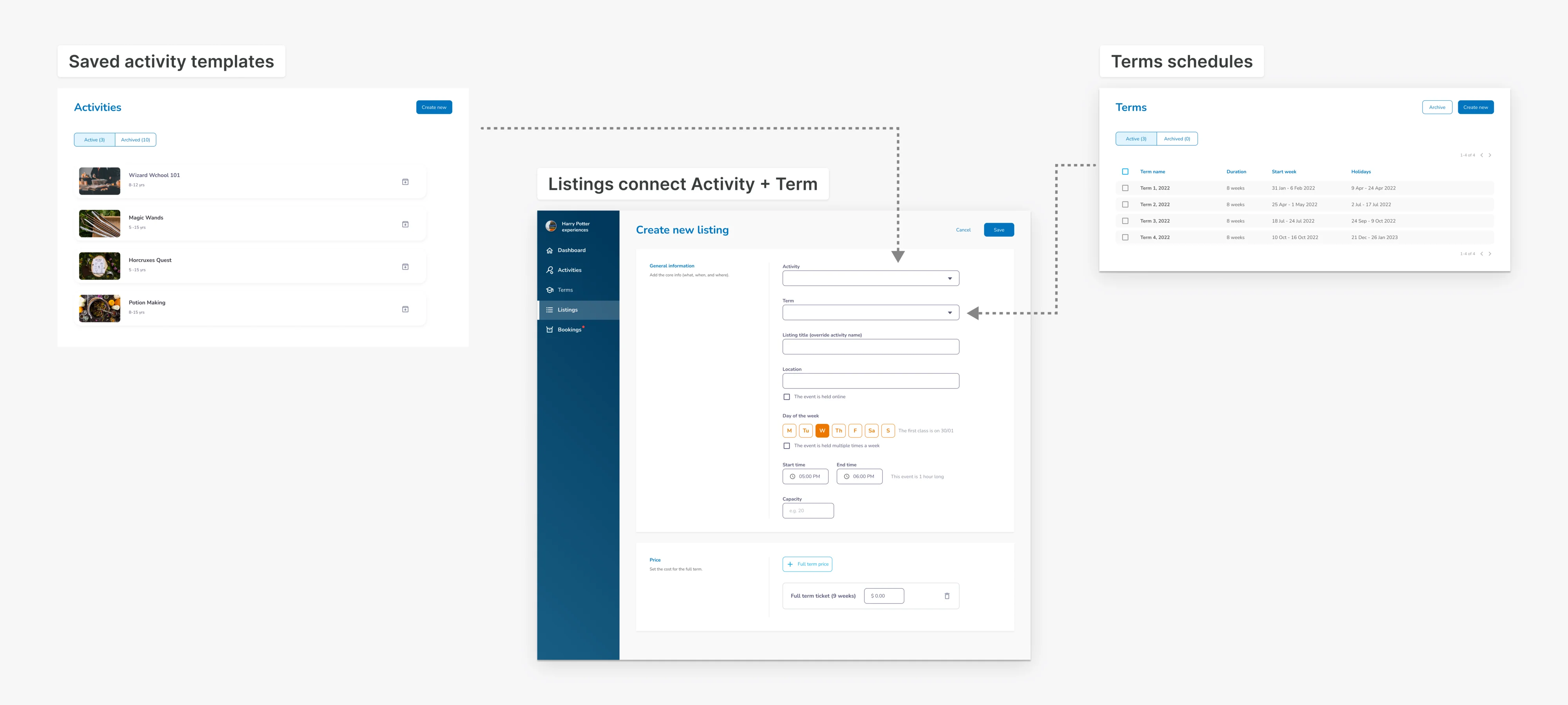
| User need | Design decision |
|---|---|
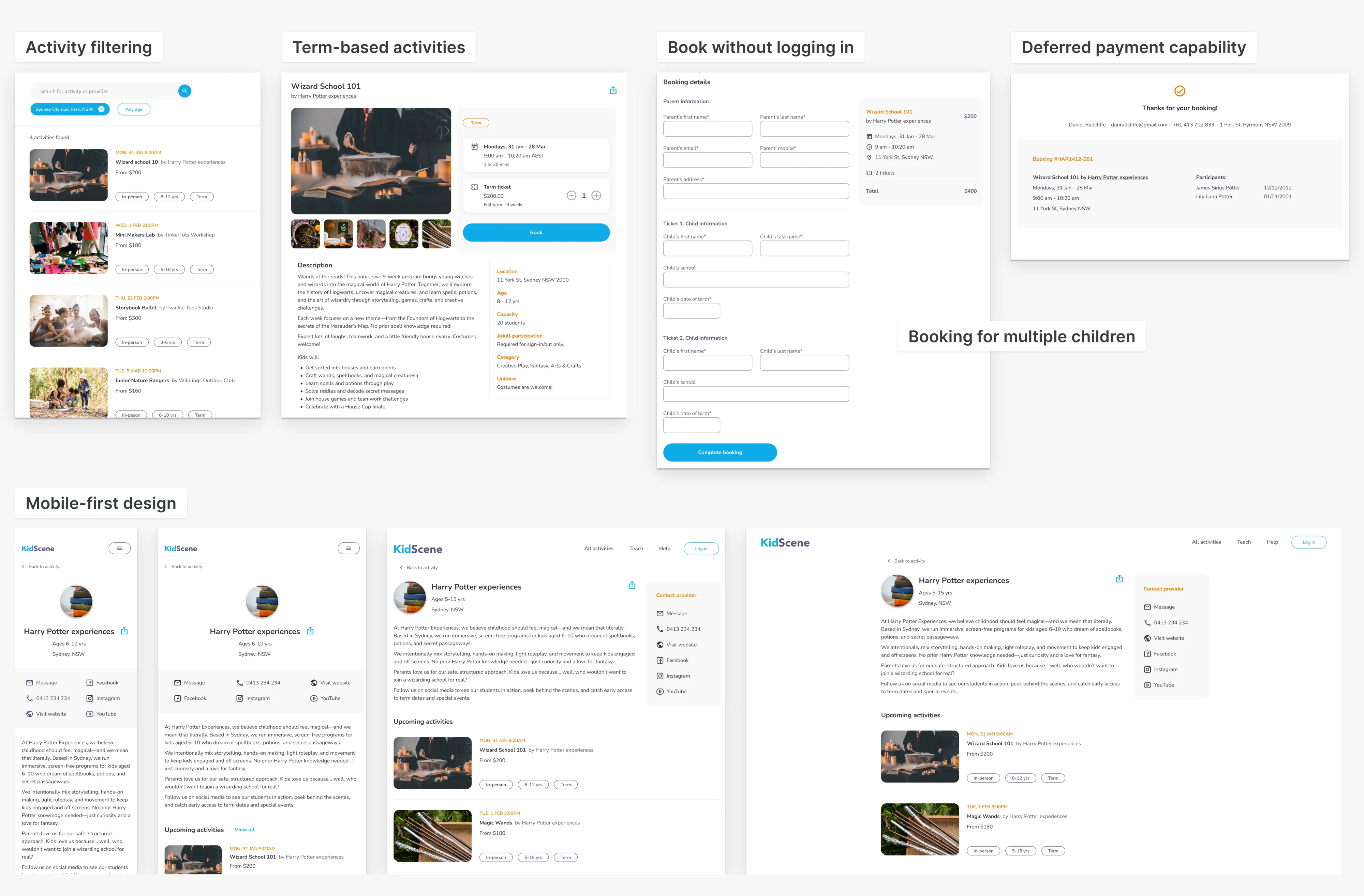
| Find relevant activities easily | Prioritised filtering by location, age, provider and activity |
| Match parent planning habits | Focused on Term-based activities |
| Book quickly with minimal effort | Allowed booking without login |
| Sibling discount | Booking flow to support single or multiple children |
| Support different payment models | Deferred payments to speed up launch |
| Use the platform on mobile | Designed mobile-first, then scaled responsively for desktop |
| Avoid unnecessary complexity in early release | Cut non-essential features (reviews, favourites, videos etc) |
Booking flow
Key design decisions
| User need | Design decision |
|---|---|
| List different activity types clearly | Focus on Term events with no payment |
| Easy onboarding | Delivered onboarding as a backend-only config, no UI flow built |
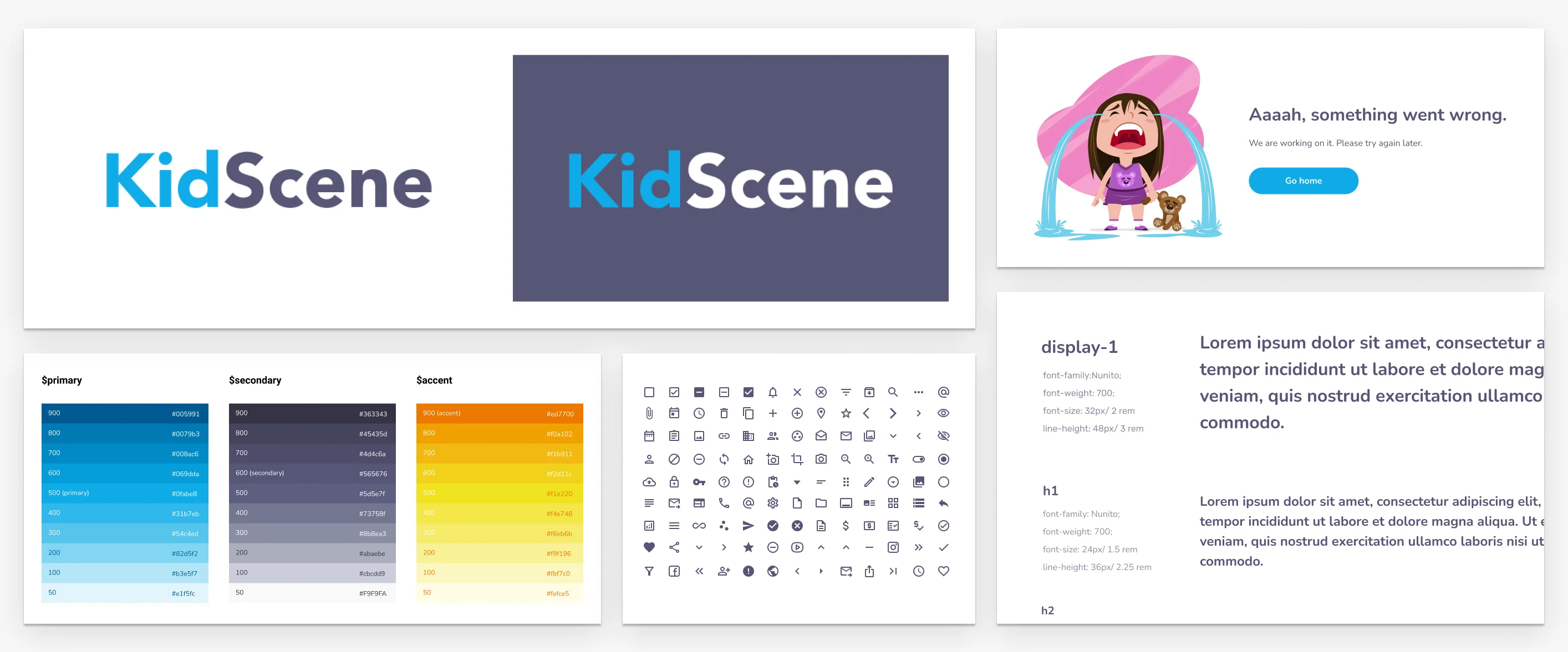
Branding the Platform from scratch
I created the full KidScene brand from scratch: logo, colours, components, and visual style. It needed to feel playful for parents and professional for providers.
To move faster, I reused SkoolBag’s setup and Material Design framework.
In hindsight, the colour combo wasn’t ideal for UI. Some colours didn’t meet accessibility standards for text, lacking sufficient contrast.
Impact
Although the project was paused mid-build due to an acquisition and shift in business direction, the work delivered:
- Validated demand from parents for a centralised booking platform
- Showed buy-in from all interviewed providers
- Validated reuse of existing console and login flow
- Upskilled team in responsive, accessible front-end
What I took from this
- Refined my mobile-first skills
- Led as both designer and product owner
- Learned proven UX patterns from top platforms
- Upskilled the whole team
Mobile-first design helped me sharpen how I handle scale, hierarchy, and structure across breakpoints. Using rems and ems improved layout consistency and made dev handoff smoother.
I led this project across both design and product. I thrived in that level of ownership. I was more deliberate in prioritising based on effort–impact tradeoffs. Collaboration was strong across the board.
Studying top event platforms helped me unpack how they build trust, design filters and manage listings.
Design and dev worked hand-in-hand. I helped the team improve their responsive UI skills, while they helped me sharpen how I communicate design intent.
Where we left off
The project was paused just before launch due to a change in business direction. While disappointing, it didn’t take away from the core value we created: a scoped, validated, and strategically designed MVP with buy-in from both sides of the market.
As a lead, I’m proud of how we de-risked the product early, reused what we had, and stayed lean without compromising on quality.
This work sharpened how I lead through ambiguity, validate value early, and design for scale from day one.