Login tickets: Eliminated
It started as a fix for login support tickets, but the OTP flow I introduced ended up clearing our backlog and becoming the preferred login method for 500,000 parents.
COMPANY
"SkoolBag" is a communication platform connecting schools and parents.
PRODUCT
Mobile app for parents to receive content from schools
PROBLEM
Parents couldn’t log into the app due to unconfirmed emails and broken password resets, leading to a increase in support tickets.
SOLUTION
New OTP login flow that solves all issues, cleared the backlog and became the preferred login method for 500,000 parents.
ROLE
Lead Product Designer / Product Owner
PLATFORM
Mobile application
KEY RESULTS
- Eliminated login issues for 500,000 users
- Unexpected technical and usability issues
“SkoolBag” (now “Audiri”) is a communication platform, where the two main products are:
- School admin console (content creation web app)
- Parent app (content interaction mobile app)
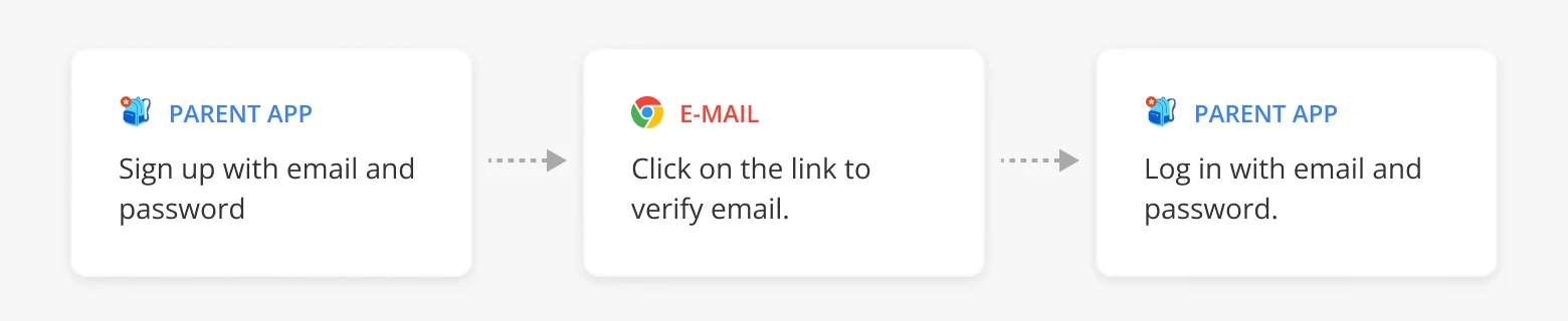
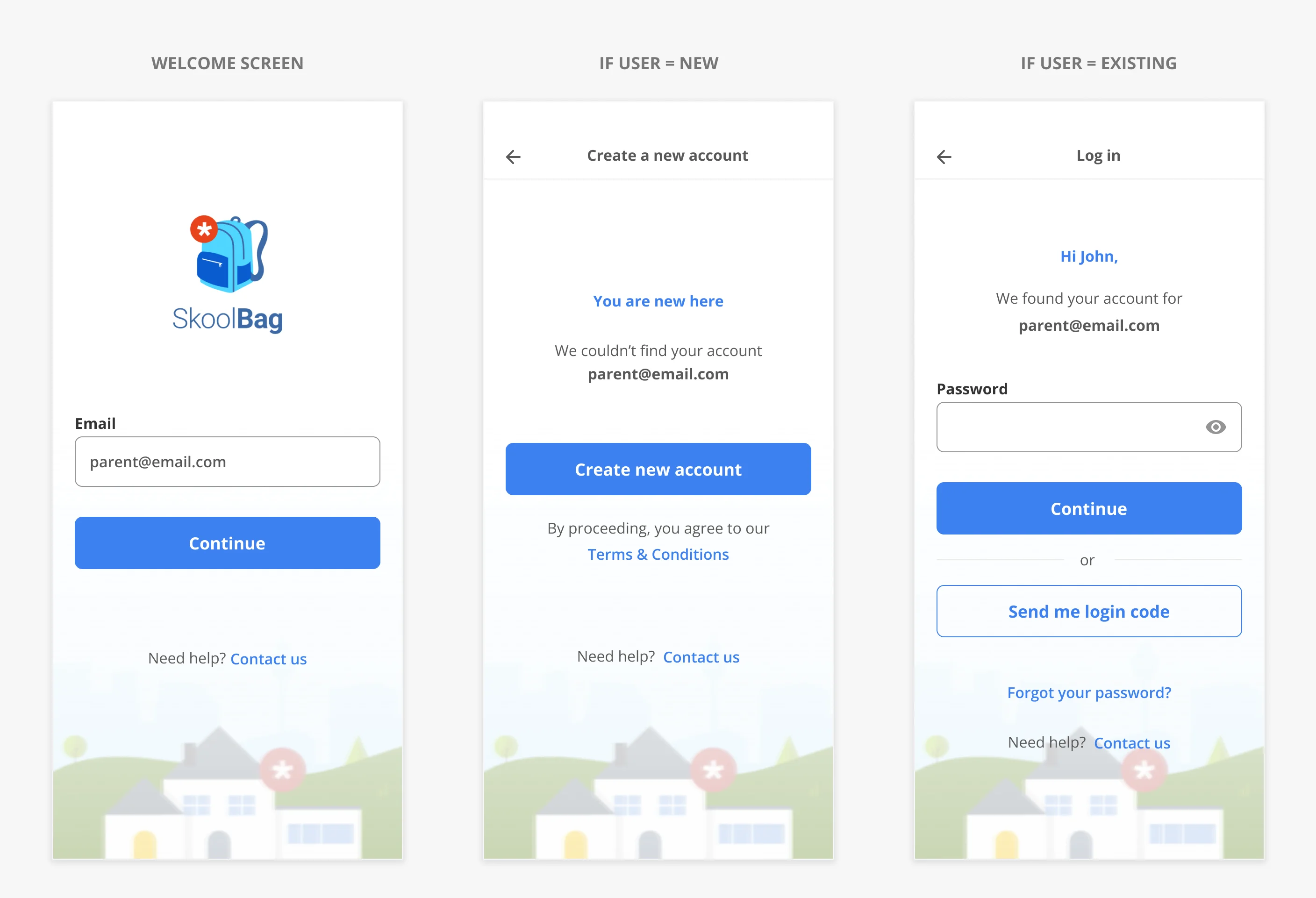
During my time with SkoolBag, parents were required to sign up for a mobile app to receive school news updates. Registration flow was pretty standard.
Log in issues
Even though the registration was straightforward, we frequently received tickets related to parents being unable to log into the app.
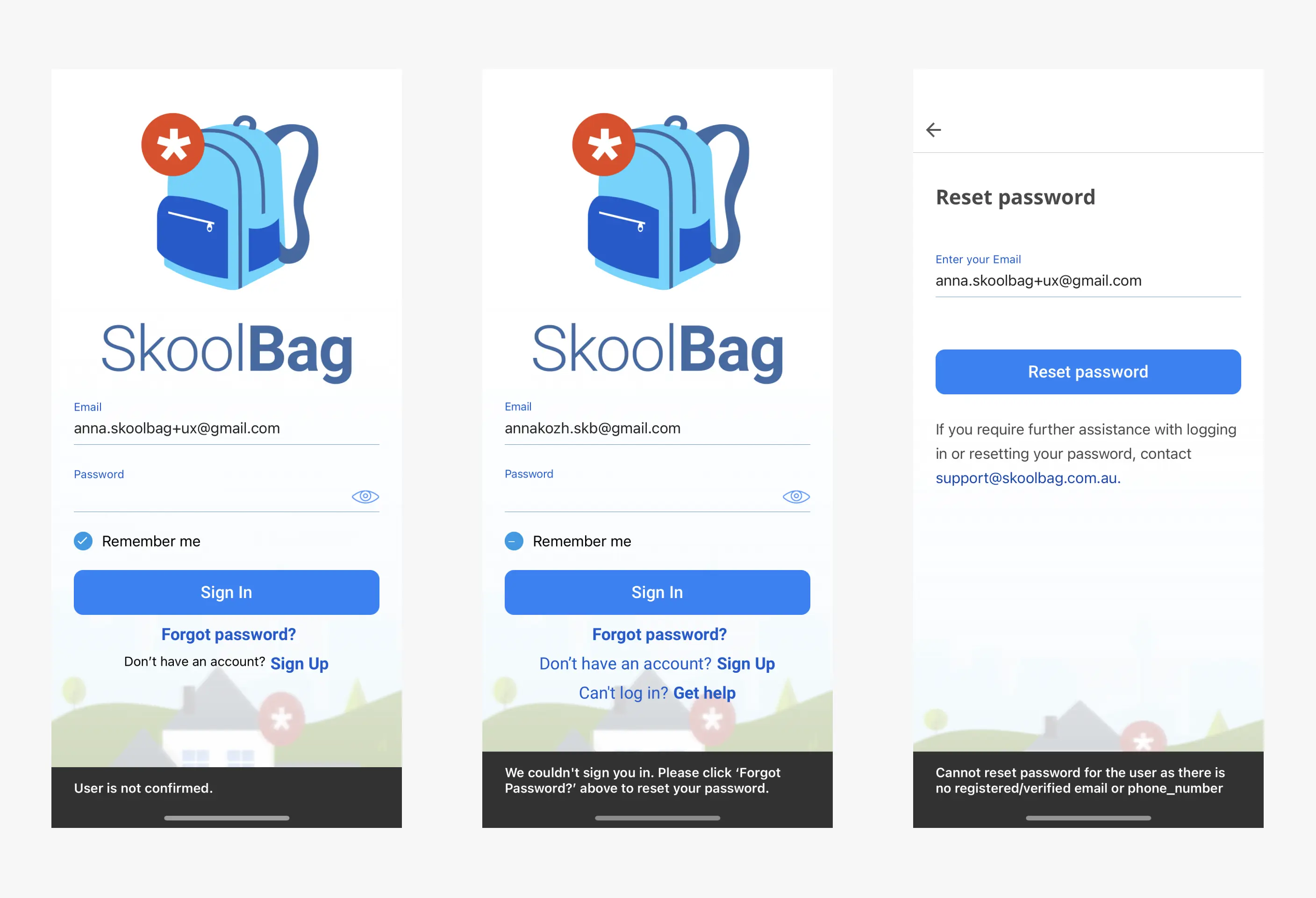
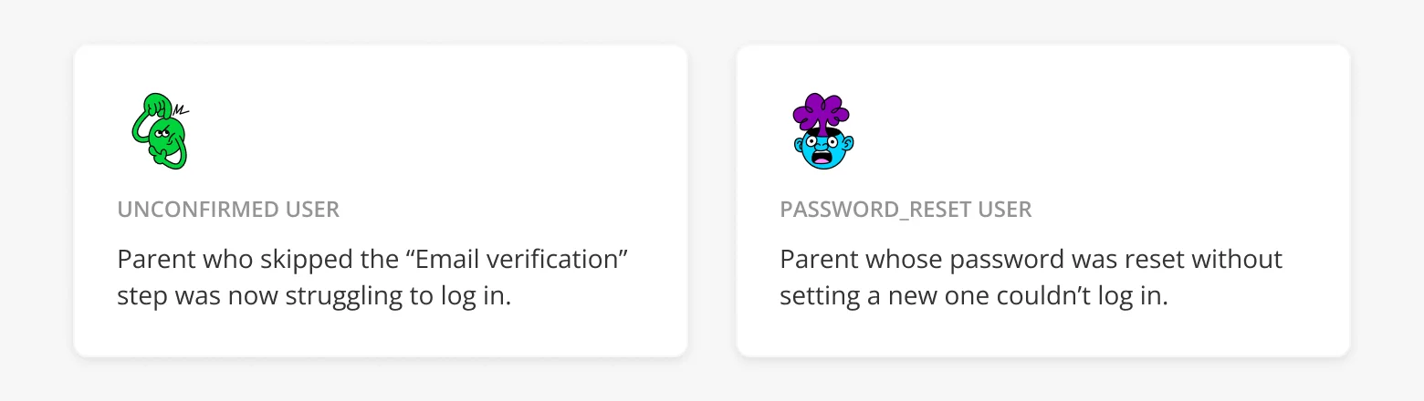
After conducting research, we identified two problems with our implementation:
- Unconfirmed users, who never confirmed their email
- Password reset users , who reset their passwords, but haven't set a new one yet.
With tight back end constraints and limited engineering capacity, we aligned on three priorities:
- Help users log in by any means necessary
- Minimize changes to the existing infrastructure
- Drastically reduce support volume
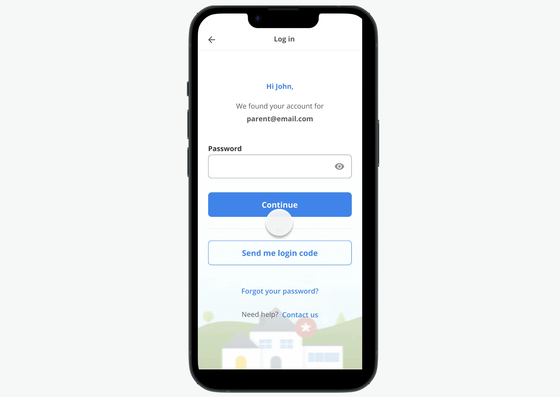
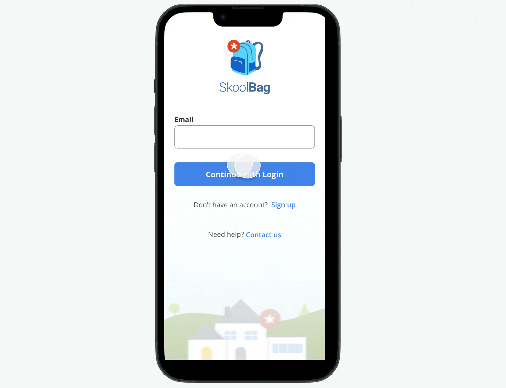
Introduce OTP
I proposed adding a One-Time Password login option. OTP had already been adopted by other apps and it solved multiple pain points at once:
- No need to remember or reset passwords
- Replaced the outdated confirmation flow
- Didn’t require reworking the entire auth flow
- Worked for both "unconfirmed" and "password reset" users
It was a pragmatic, high-leverage addition that respected technical limits while delivering clear user value.
Impact
OTP was a turning point. Within weeks of the rollout:
- Login-related tickets dropped to near-zero
- Unconfirmed accounts were no longer a blocker
- Users consistently chose OTP over password login
Iteration: Merging Login & Signup
I explored a more ambitious idea to combine login and signup into a single entry point. Inspired by patterns used by larger apps, the idea was simply ask for an email and redirect users behind the scenes.
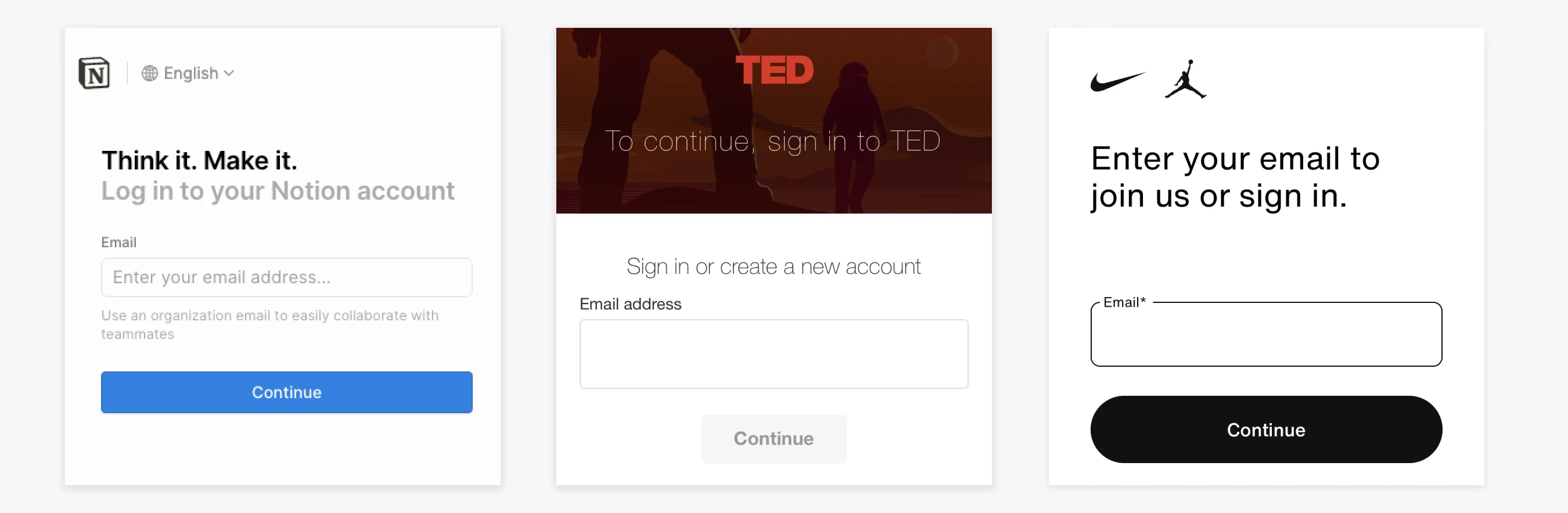
In theory, it should have streamlined the experience and helped users who weren’t sure if they already had an account.
In practice, it introduced confusion:
- Users weren’t sure if they were logging in or signing up
- The mental model of “Login vs Signup” was too ingrained to remove without cost
The feedback was clear: not all patterns scale across user types. Especially when those users are busy parents expecting clarity over cleverness.
Refined UX
I updated the UI to clearly show two entry points: Login and Signup.
On the back end, the flow remained the same: users still received a one-time code via email, but the new labels aligned with user expectations.
Outcome: Confusion dropped and support tickets dropped to near zero.
Lessons Learned
- Even widely-used UX patterns need validation with your users.
- Clarity always wins. Cleverness is only valuable when users don’t have to think about it.