White label design system
The state of our design files was slowing everything down. Branding was manual, handovers were confusing and devs were working with outdated assets. I took ownership of the problem and built a system that finally scaled with the product.
COMPANY
Simpology (fintech, white-label mortgage products)
PROBLEM
Without a unified system, design was inconsistent, branding was slow and developers had to fill in the gaps, which led to errors in front-end implementation.
SOLUTION
Design system with shared libraries and brand variables, that enables fast branding, consistent handover and easier maintenance.
ROLE
Lead Product Designer
KEY RESULTS
- The new design file structure is easier to navigate and maintain
- Design deliverables are more consistent and clear
- Feature turnaround sped up by 32%
- Branding a product file is now a 5-second task
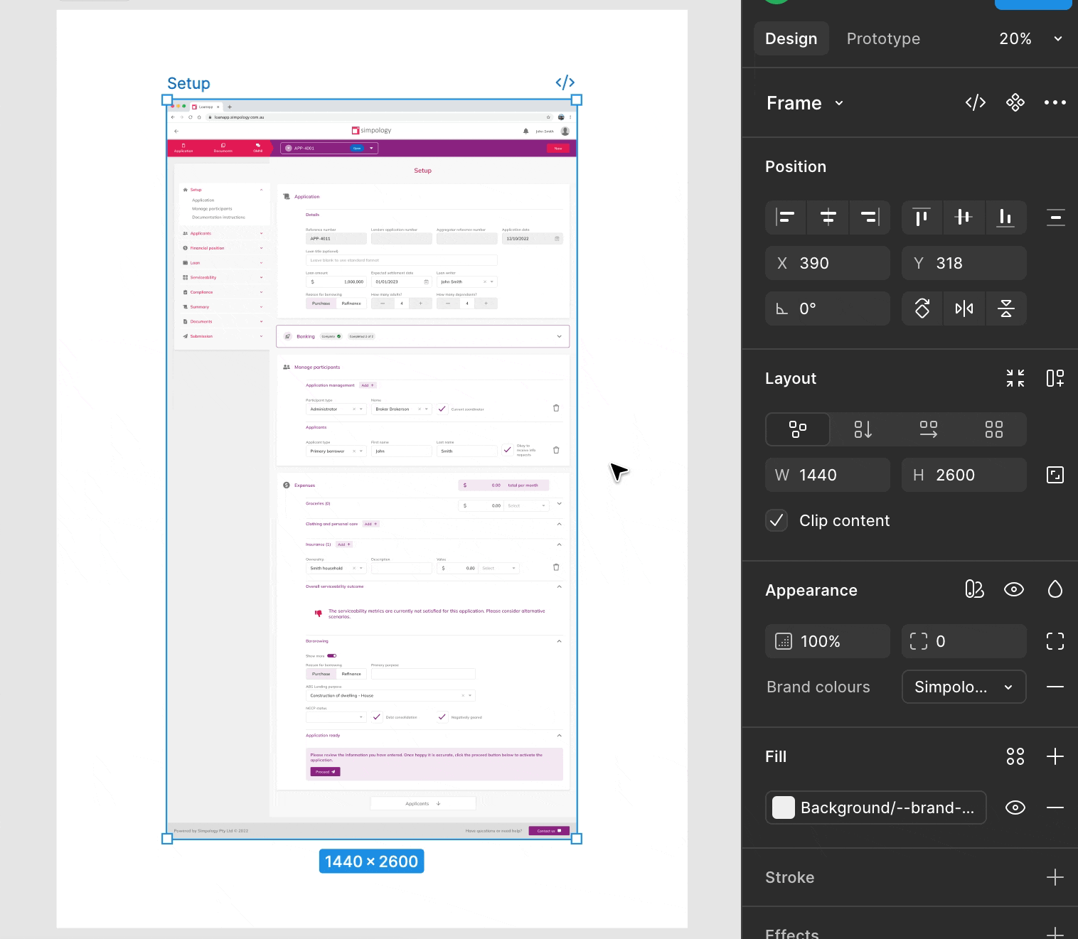
"Simpology" is an end-to-end home loan application platform. The company offers multiple products, which lenders can customise to seamlessly integrate with their existing ecosystem.
The challenge
When I joined, design and development were completely disconnected. I was spending hours QA-ing front-end work, fixing mistakes and clarifying design intentions. The lack of structure didn’t just slow us down, it created constant friction and wasted effort.
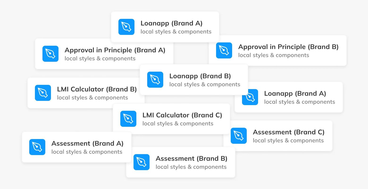
Design had evolved over time, but the files hadn’t. We had over a dozen disconnected Figma files, each with its own colours, fonts, and components. Developers relied on guesswork and every branding setup involved hours of manual effort.
Onboarding a new client meant duplicating a file, updating styles one by one, and hoping nothing broke. We had no reliable source of truth.
Phase 1 - Align with devs
The first goal was to reflect reality. What I've done:
- Audited all design files
- Partnered with front-end devs to align on design tokens
- Created per-brand libraries of styles
- Recreated wireframes and key flows to reflect the real product
Impact
- Design files became reliable and usable
- Shared naming reduced confusion in handover
- New features were built faster using consistent components
- Improved front-end task completion speed by 32%
That worked pretty well, but had a few flaws:
- Swapping libraries made revisions difficult.
- Maintaining the libraries was a part-time job.
Phase 2 - Era of variables
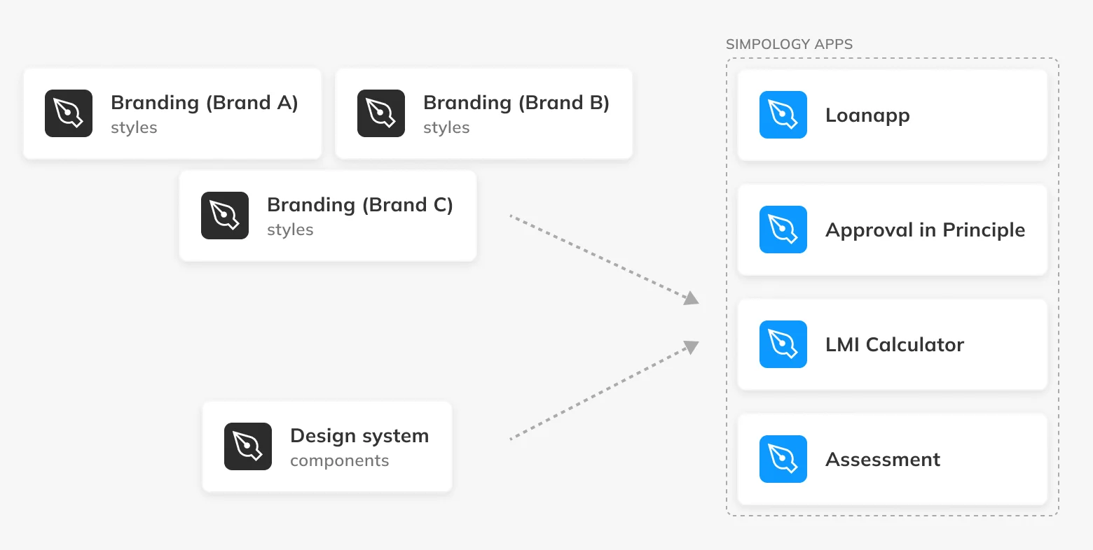
When Figma Variables launched, I saw the opportunity to consolidate everything. I combined all customer branding into a single source-of-truth file.
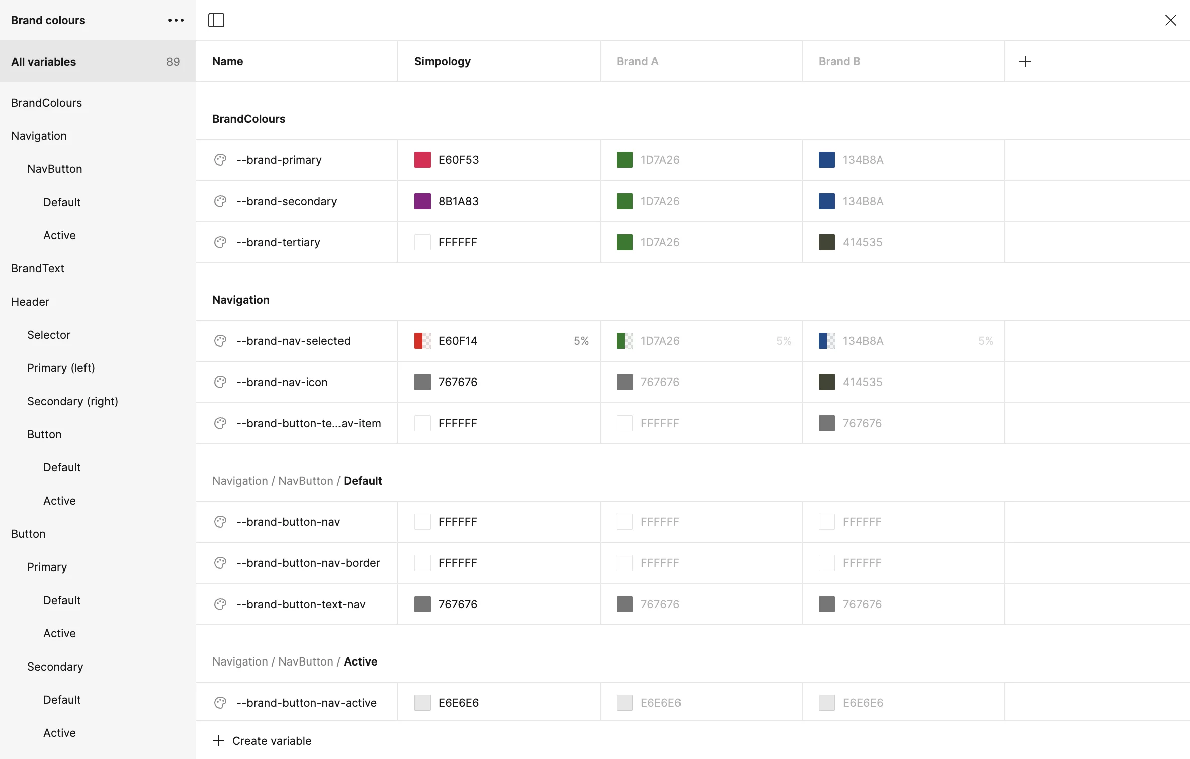
I rebuilt the design system using component variants and properties.
Both libraries contributed to the ecosystem of Simpology products:
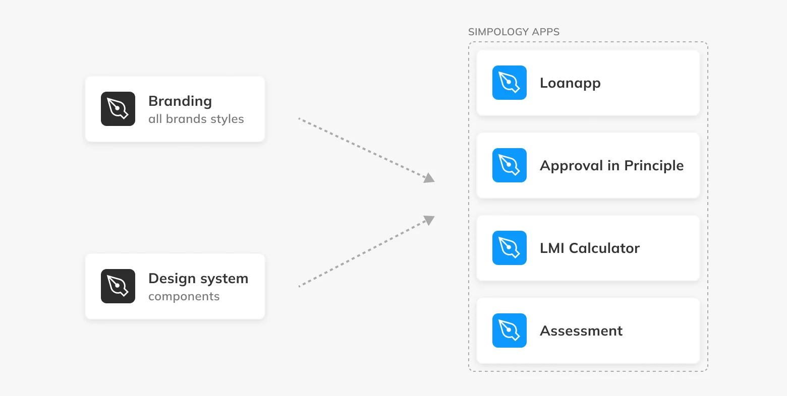
Impact
- Rebranding now takes only 5 seconds
- Maintaining brand libraries is now efficient
- No more broken styles when switching brands
- The design system now powers our full product ecosystem
Strategic decisions
Throughout the rebuild, I made decisions that kept the system lean while making future growth easier.
- Scoped branding logic to match dev tokens to reduce translation issues
- Kept brands in a single file for visibility and version control
- Deferred typography and spacing variables until naming was aligned with dev
What's next
Currently, we have a good system of libraries that meets the company's needs. However, as Simpology grows, we need new improvements:
- Expanding the system with spacing and typography tokens
- Collaborating with engineering on token implementation
- Introducing processes like RACI to clarify design ownership as the team grows
Lessons learned
- Staying up to date with Figma releases and industry updates can unlock major efficiency gains.
- Working shoulder to shoulder with developers was essential. Design system isn’t a designer’s asset, it’s a shared product. Building it together ensured we aligned on structure, tokens and naming, so we could speak the same language and move faster.